
The Mini Cart module lets you add a WooCommerce cart to your Divi layout, so shoppers can view and manage cart items without leaving the current page. It supports dropdown, slide-out, modal, and fullscreen layouts.
Important Note:
- For site-wide access, we recommend placing the module inside your Theme Builder Global Header.
- The module is hidden by default on WooCommerce Cart and Checkout pages.
Let’s see the settings in brief and how to make better use of them —
Content Tab #
This tab lets you customize the cart trigger, cart type, panel content, floating trigger, coupon field, and empty-cart state.
Cart Trigger #
These settings control the main cart button placed inside your Divi layout.
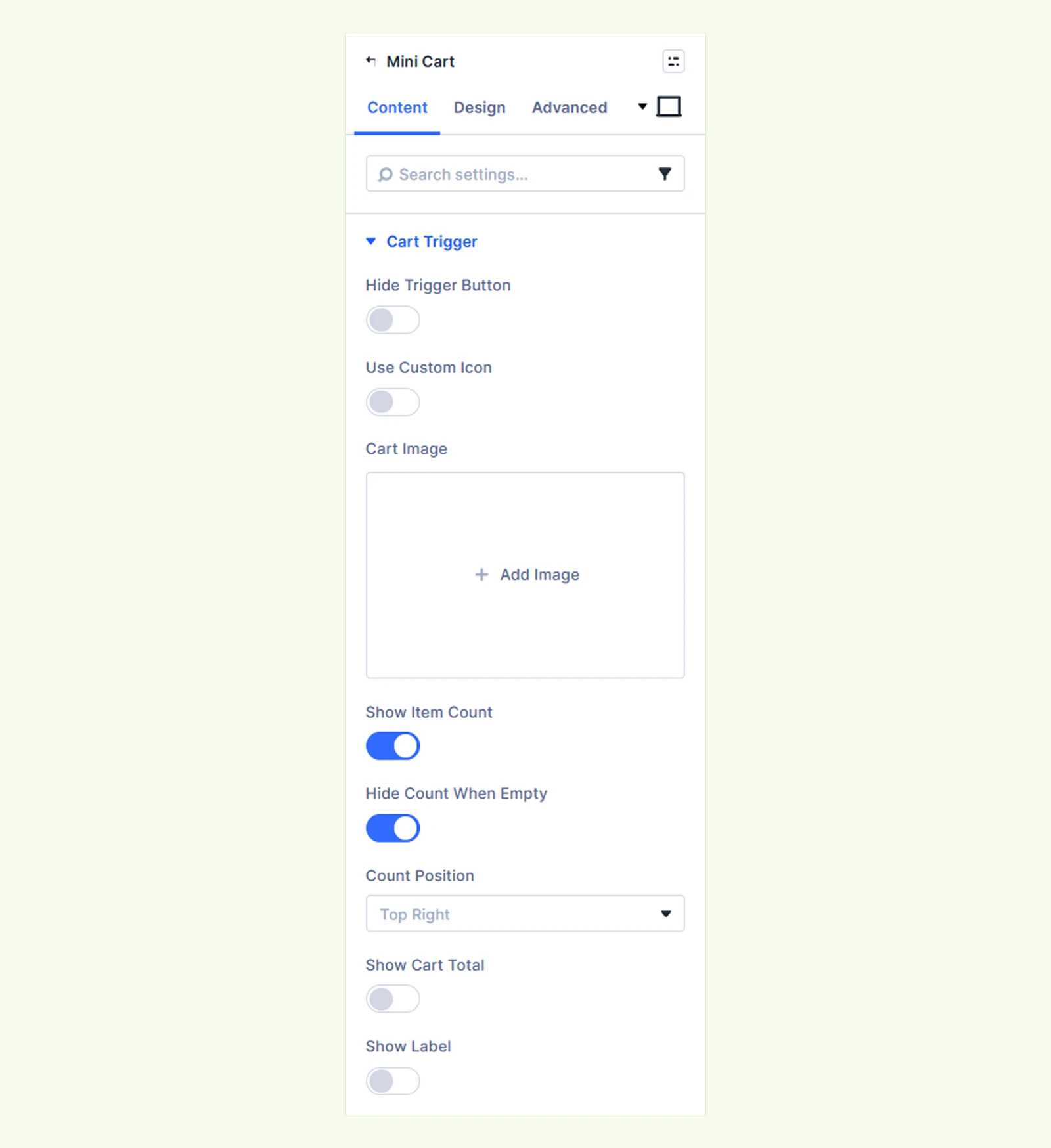
- Hide Trigger Button: Hide the module’s default cart button when you want to use another element to open the cart. (You can add the divimerc-minicart-open class to a button, icon, or link to use it as the cart trigger.)
- Use Custom Icon: Choose whether to use an icon from Divi’s icon library.
- Cart Icon: Select the icon used for the cart trigger.
- Cart Image: Upload a custom image to use instead of the cart icon.
- Show Item Count: Show or hide the number of items currently in the cart.
- Hide Count When Empty: Hide the item count when the cart is empty.
- Count Position: Choose where the item count appears. Available options are: Top Right, Top Left and Inline.
- Show Cart Total: Show or hide the cart subtotal beside the cart trigger.
- Hide Total When Empty: Hide the cart total while the cart is empty.
- Show Label: Show optional text beside the cart icon.
- Label Text: Customize the trigger label. If left empty, Cart is used.
Floating Trigger #
Use these settings to add a second cart button that stays fixed on the screen while visitors scroll.
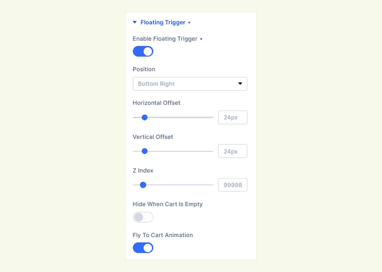
- Enable Floating Trigger: Enable or disable the floating cart button.
- Position: Choose where the floating button appears on the screen. Available options are:
- Bottom Right
- Bottom Left
- Middle Right
- Middle Left
- Top Right
- Top Left
- Horizontal Offset: Adjust the horizontal distance between the floating trigger and the selected screen edge.
- Vertical Offset: Adjust the vertical distance between the floating trigger and the selected screen edge.
- Z Index: Control the stacking position of the floating trigger. (Increase it if another element, such as a sticky header or chat widget, appears above it.)
- Hide When Cart Is Empty: Hide the floating trigger until a product is added to the cart.
- Fly To Cart Animation: Animate the product image toward the floating cart button when a product is added. (Requires AJAX Add to Cart to be enabled in the DiviMerc’s Advanced Add to Cart module.)
Cart Type & Behaviour #
Use these settings to control how the cart appears and opens.
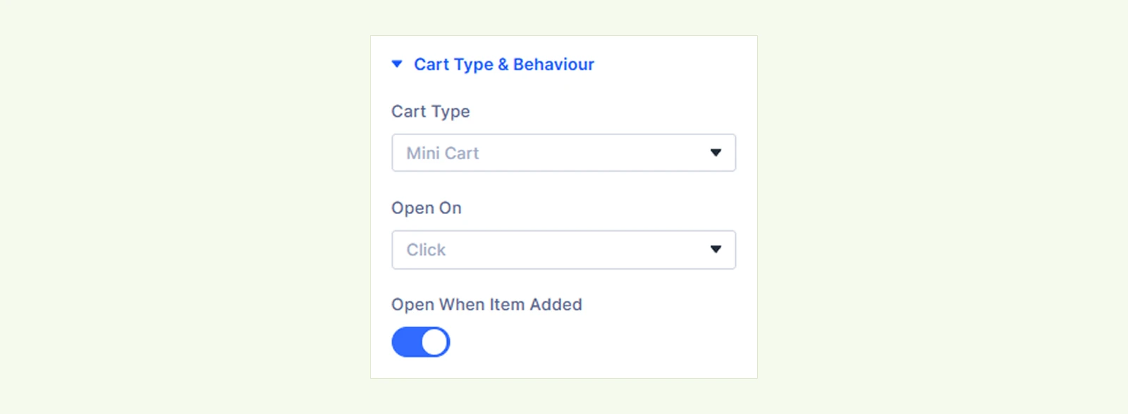
- Cart Type: Choose how the cart panel appears. Available options are:
- Mini Cart: Opens a dropdown near the cart trigger.
- Slide Cart: Opens a full-height drawer from the side of the screen.
- Modal: Opens the cart in the center of the screen.
- Fullscreen: Opens the cart across the full screen.
- Slide From: Choose whether the Slide Cart opens from the Left or Right. (Available only when Cart Type is set to Slide Cart.)
- Reveal Style: Choose how the Slide Cart interacts with the page. Available options are:
- Overlay Page: The cart slides over the page.
- Off Canvas: The page moves aside as the cart opens.
(Available only when Cart Type is set to Slide Cart.)
- Open On: Choose whether the Mini Cart dropdown opens on Click or Hover. (Available only when Cart Type is set to Mini Cart.)
- Open When Item Added: Automatically open the cart after a product is added through an AJAX Add to Cart action.
Note: Open When Item Added only works when the product is added without reloading the page. If you are using DiviMerc’s Advanced Add to Cart module, enable its AJAX Add to Cart setting.
Panel Content #
These settings control what appears inside the cart panel.
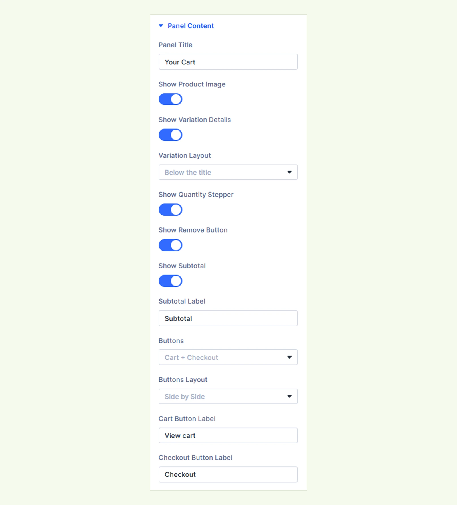
- Panel Title: Customize the heading displayed at the top of the cart.
- Show Product Image: Show or hide product thumbnails.
- Show Variation Details: Show or hide selected product variation details, such as color and size.
- Variation Layout: Choose how variation details appear. Available options are:
- Below the title
- Beside the title
- Variation Layout: Choose how variation details appear. Available options are:
- Show Quantity Stepper: Show or hide the quantity control shoppers can use to increase or decrease product quantities.
- Show Remove Button: Show or hide the remove button for each cart item.
- Show Subtotal: Show or hide the cart subtotal.
- Subtotal Label: Customize the subtotal text.
- Buttons: Choose which action buttons appear inside the cart. Available options are:
- Cart + Checkout
- Checkout only
- Cart only
- None
- Buttons Layout: Choose whether the View Cart and Checkout buttons appear Side by Side or Stacked. (Available when Buttons is set to Cart + Checkout.)
- Cart Button Label: Customize the View Cart button text.
- Checkout Button Label: Customize the Checkout button text.
Cart Elements #
Use these settings to add a coupon field to the cart.
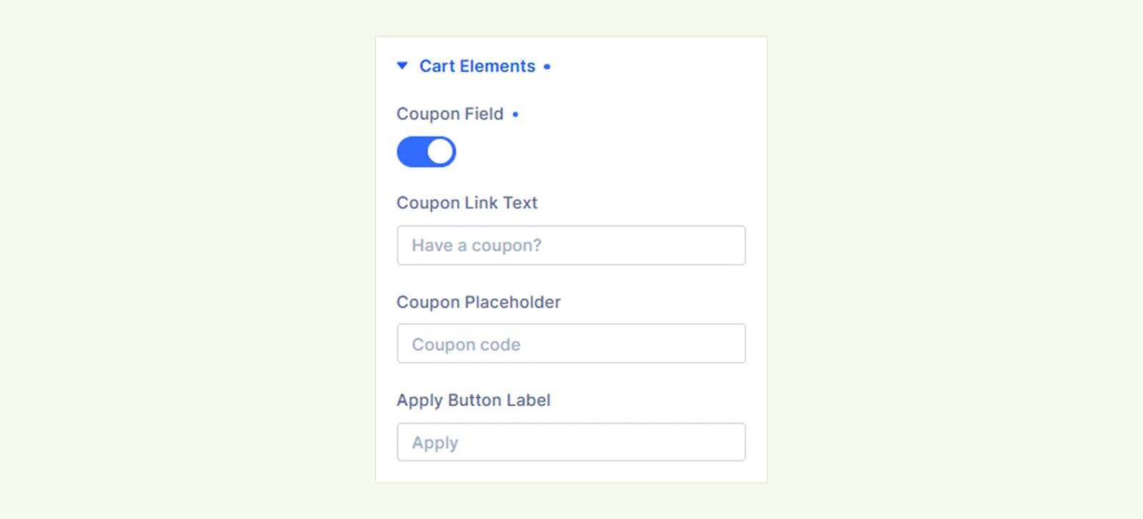
- Coupon Field: Show or hide the coupon option.
- Coupon Link Text: Customize the text shoppers click to open the coupon field.
- Coupon Placeholder: Customize the placeholder inside the coupon field.
- Apply Button Label: Customize the coupon Apply button text.
When a valid coupon is applied, the cart displays the discount and updates the subtotal automatically.
Empty Cart #
Use these settings to customize what shoppers see when their cart is empty.
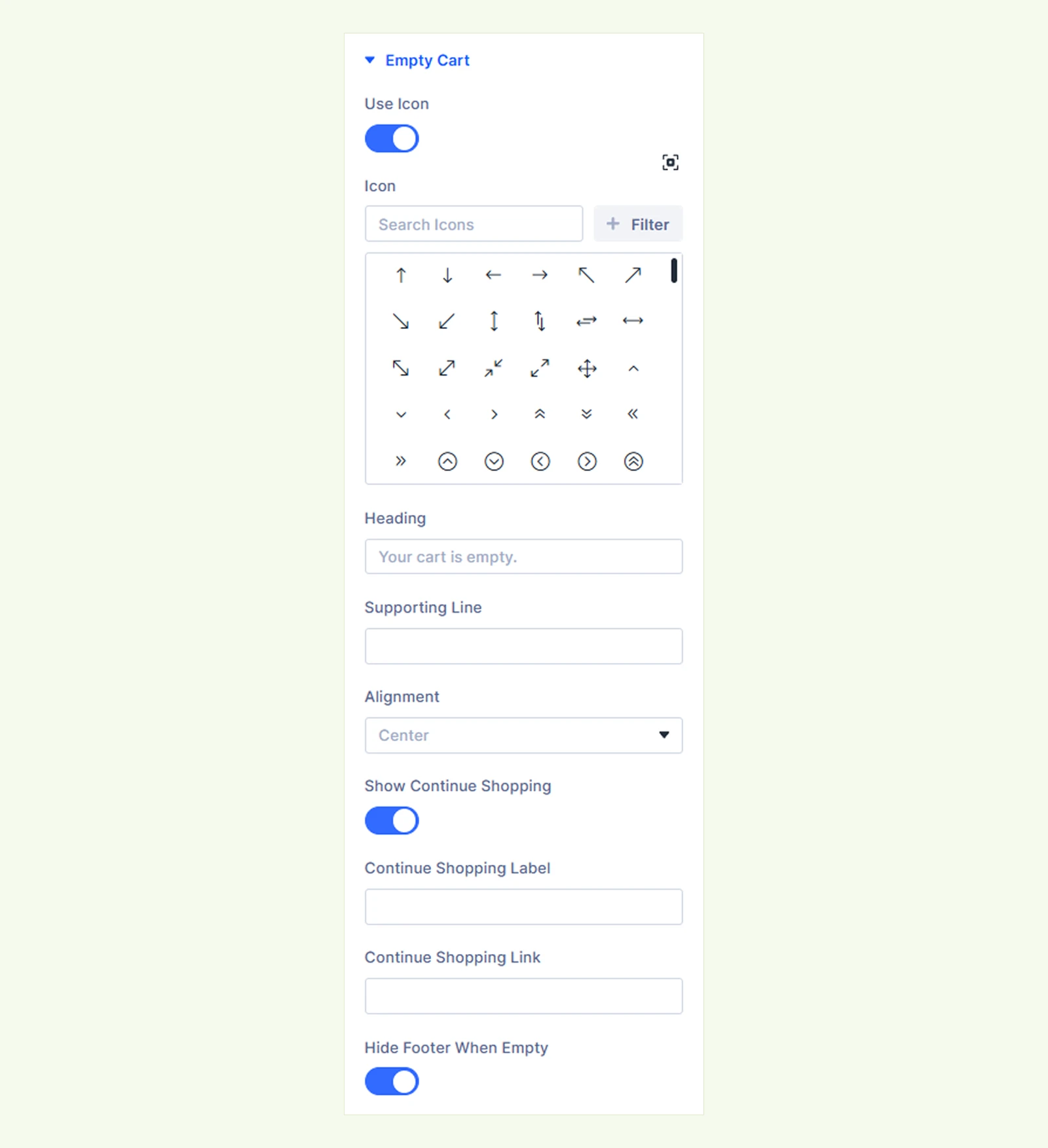
- Use Icon: Choose whether to display an icon or uploaded image in the empty-cart state.
- Icon: Select the icon displayed when the cart is empty. If no icon is selected, the default shopping bag icon is used.
- Image: Upload an image for the empty-cart state.
- Heading: Customize the empty-cart heading.
- Supporting Line: Add optional supporting text below the heading.
- Alignment: Align the empty-cart content to the Left, Center, or Right.
- Show Continue Shopping: Show or hide the Continue Shopping button.
- Continue Shopping Label: Customize the button text.
- Continue Shopping Link: Set where the Continue Shopping button should take visitors.
- Hide Footer When Empty: Hide the subtotal, coupon field, and cart buttons while the cart is empty.
Background: Add a background color, gradient, image, video, pattern, or mask to the module.
Element Label: Rename the module for easier identification in the Divi Builder. This label is only visible to you.
Design Tab #
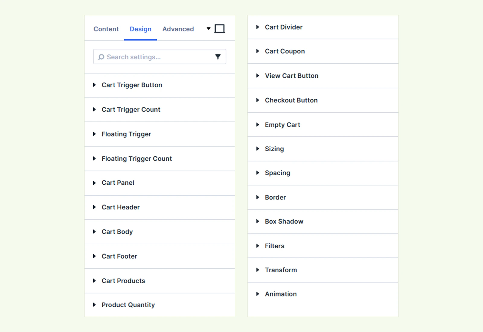
This tab lets you customize the appearance of the cart trigger, floating trigger, cart panel, products, buttons, coupon field, and empty-cart state.
Cart Trigger Button #
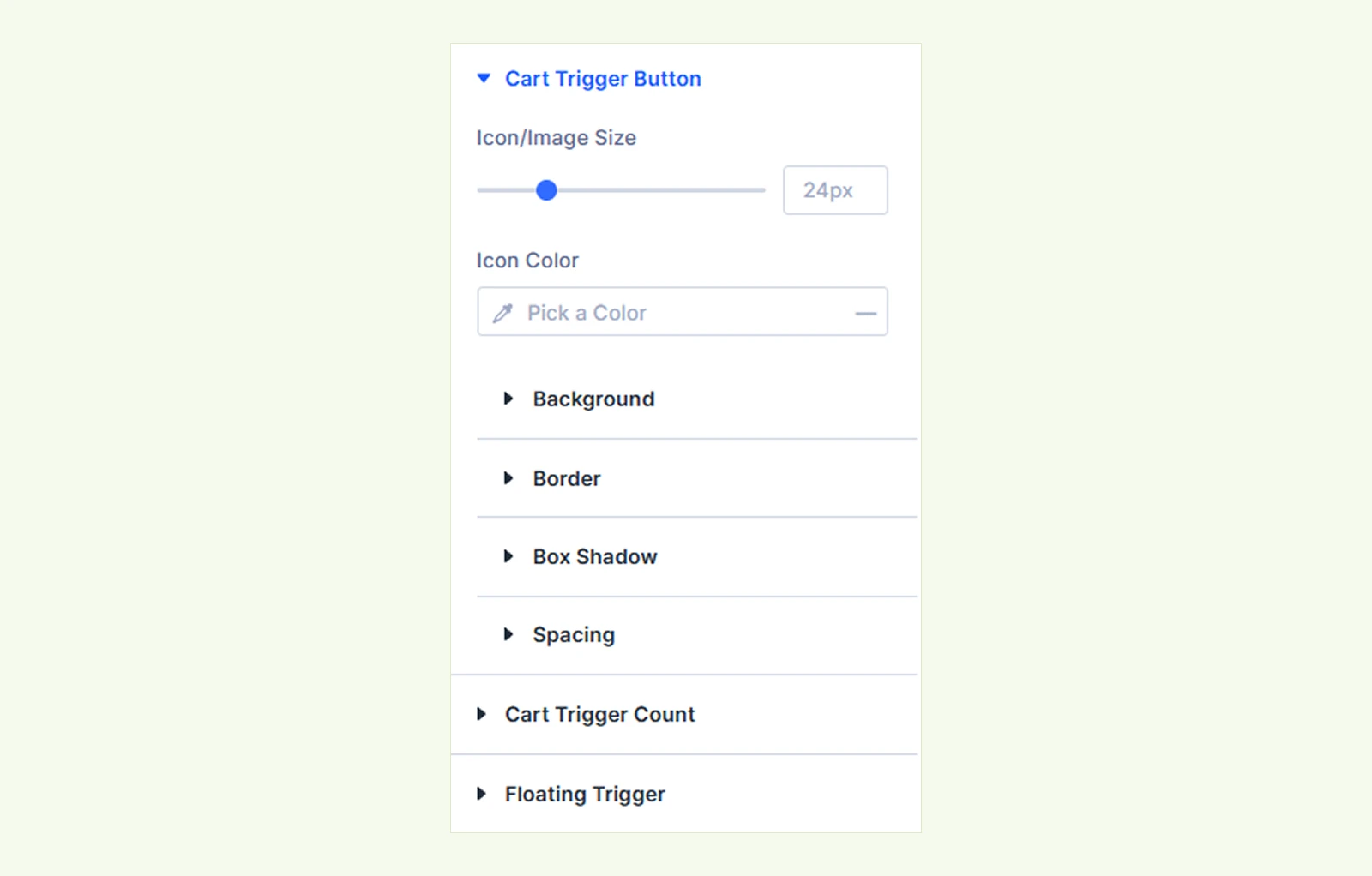
- Icon/Image Size: Adjust the size of the cart icon or uploaded image.
- Icon Color: Set the cart icon color and customize its hover color.
You will also find settings to customize the trigger’s text, background, spacing, border, and box shadow.
Cart Trigger Count: Customize the item count text and background. (Available when Show Item Count is enabled.)
Cart Trigger Price: Customize the cart total text and spacing. (Available when Show Cart Total is enabled.)
Floating Trigger: Customize the floating cart button, including its icon, size, background, spacing, border, and box shadow. (Available when Enable Floating Trigger is enabled.)
Floating Trigger Count: Customize the item count text and background on the floating trigger. (Available when Enable Floating Trigger is enabled.)
Cart Panel: Customize the cart panel background, sizing, spacing, border, and box shadow.
Cart Header #
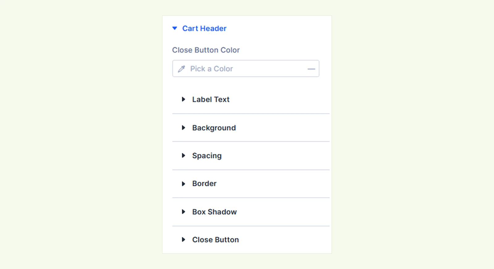
- Close Button: Customize the size of the close button.
- Close Button Color: Set the close button color.
You will also find settings to customize the panel title, background, spacing, border, and box shadow.
Cart Body: Customize the cart body background, spacing, and remove icon.
Cart Footer: Customize the subtotal text, old subtotal text, background, spacing, border, and box shadow.
Cart Products #
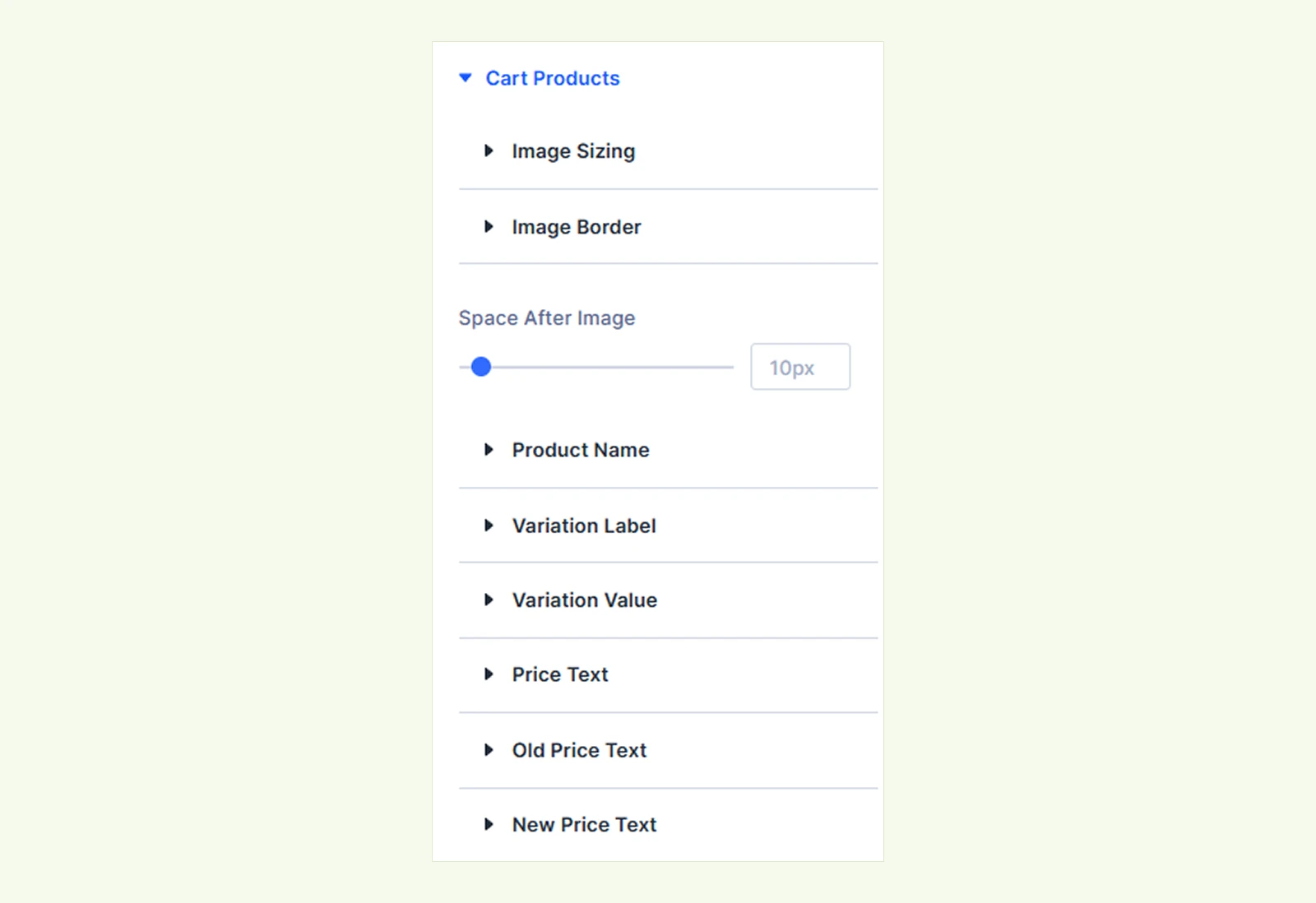
- Space After Image: Adjust the space between the product image and product information.
You will also find settings to customize the product image size and border, product name, variation labels and values, product price, old price, and new price.
Product Quantity #
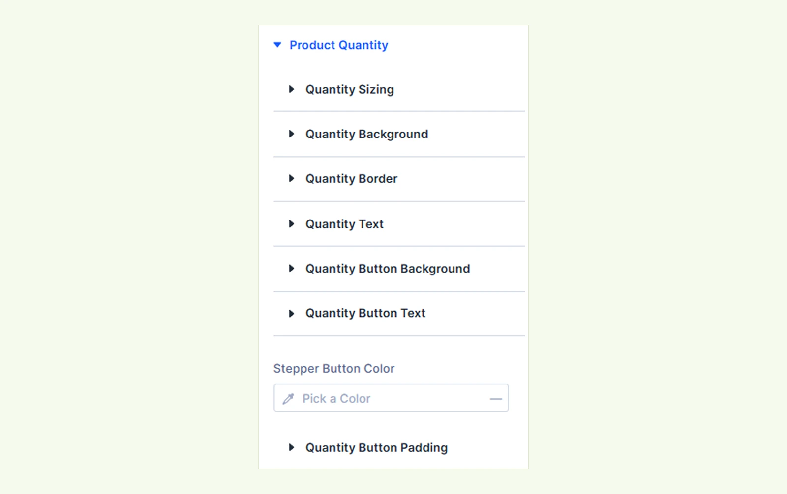
- Stepper Button Color: Set the color of the quantity stepper buttons.
You will also find settings to customize the quantity control’s size, background, border, text, button background, button text, and padding.(Available when Show Quantity Stepper is enabled.)
Cart Divider #

- Divider Color: Set the color of the divider between cart products.
- Space Between Products: Adjust the spacing between individual cart items.
Cart Coupon: Customize the coupon link, coupon field, Apply button, messages, applied coupon, discount amount, and remove icon. (Available when Coupon Field is enabled.)
View Cart Button: Customize the View Cart button’s text, background, spacing, border, sizing, and box shadow. (Available when Buttons includes the Cart button.)
Checkout Button: Customize the Checkout button’s text, background, spacing, border, sizing, and box shadow. (Available when Buttons includes the Checkout button.)
Empty Cart #
Icon Color and Icon Size are available when Use Icon is enabled, while Image Width applies when it is disabled.
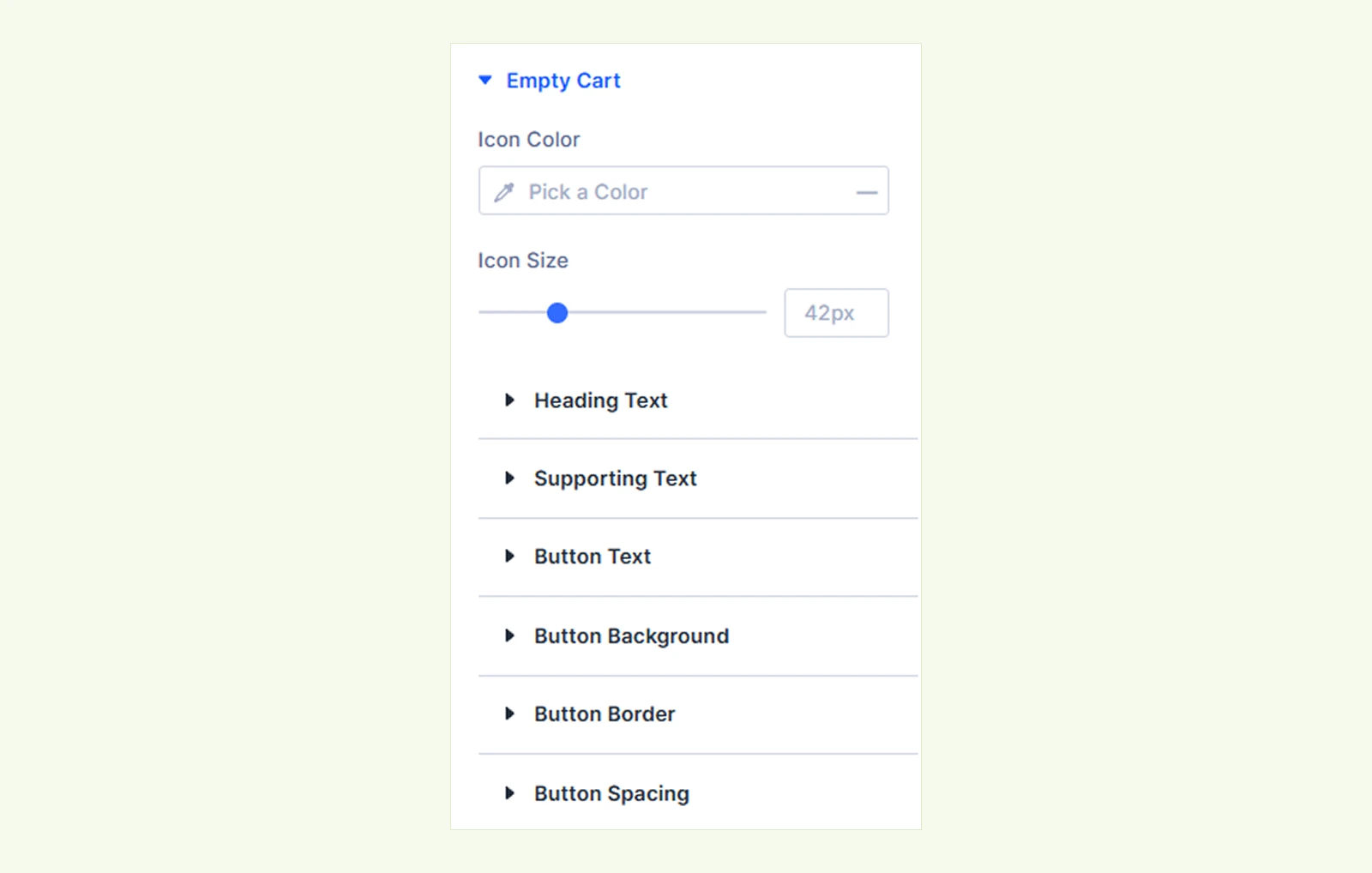
- Icon Color: Set the color of the empty-cart icon.
- Icon Size: Adjust the size of the empty-cart icon.
- Image Width: Adjust the width of the empty-cart image.
You will also find settings to customize the heading, supporting text, and Continue Shopping button.
Sizing: Adjust the width, height, and alignment of the module.
Spacing: Adjust the margin and padding around the module.
Border: Customize the border radius, style, width, and color.
Box Shadow: Add a shadow effect to the module.
Filters: Apply color filters to change the visual appearance of the module.
Transform: Scale, rotate, move, or skew the module.
Animation: Apply reveal animation effects and customize the animation type, duration, delay, and more.
Advanced Tab #
This tab provides additional settings for advanced users who want greater control over the module with custom CSS, conditions, visibility, and more.
Need Help? #
If you have any questions or need assistance, contact our support team: [email protected]


