
The DiviMerc Order Confirmation module lets you customize your WooCommerce thank-you page with order details, confirmation messages, payment information, and more.
Important Note:
- The Order Confirmation module is disabled by default and must be enabled manually in DiviMerc.
- When enabling Order Confirmation, you can optionally enable Custom Thank You Page to create a thank-you page layout in the Divi Library.
- Add the module to your checkout page, its Theme Builder template, or a Custom Thank You Page layout. It displays only after an order is placed.
- When Custom Thank You Page is enabled and configured, its layout takes priority over the checkout page's Order Confirmation module.
- If multiple Order Confirmation modules are added, only the first one is displayed.
Let's see the settings in brief and how to make better use of them —
Content Tab #
The Content tab lets you choose a template, show or hide order confirmation sections, arrange their positions, and customize the information displayed after checkout.
Template #
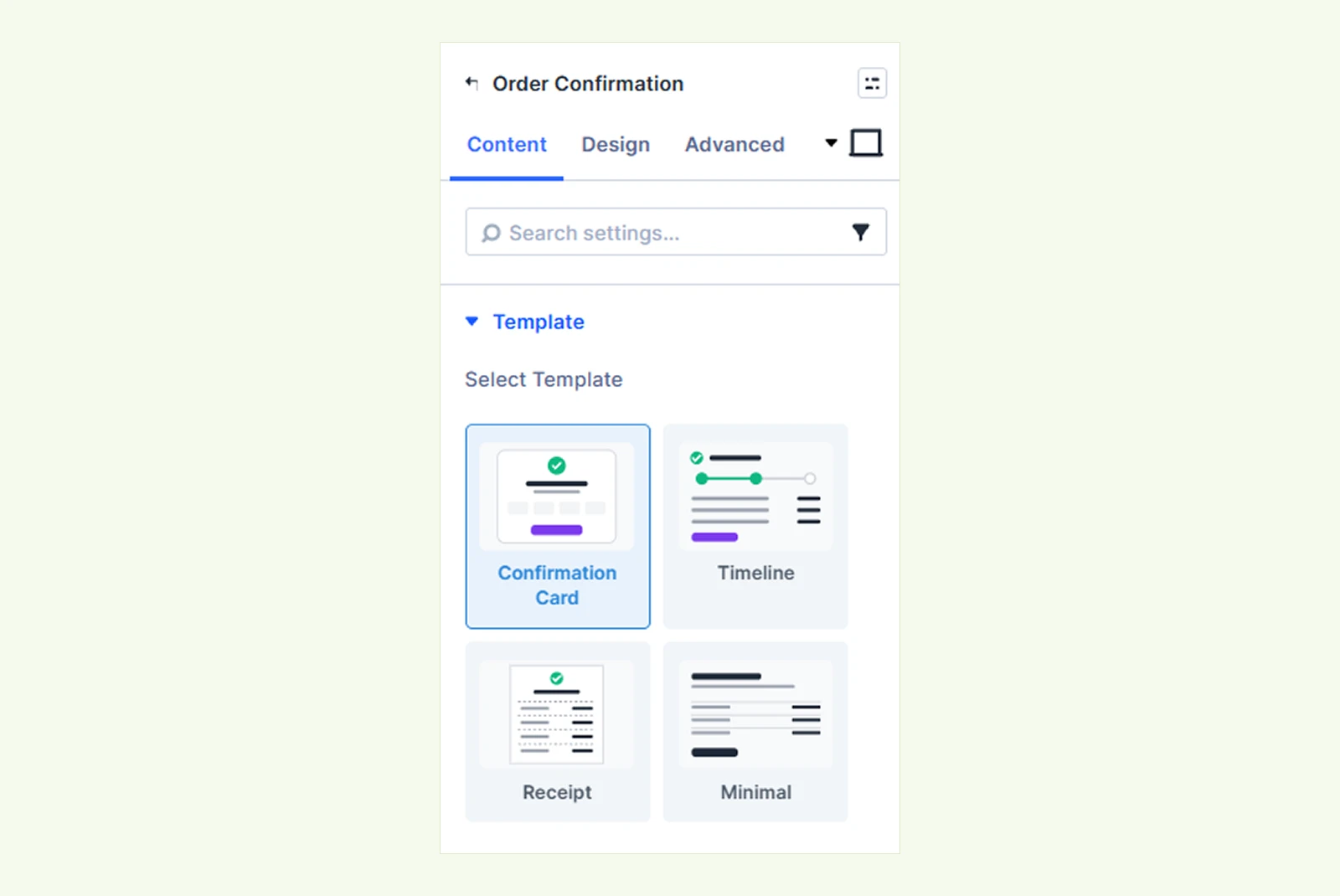
- Select Template: Choose a layout for the order confirmation page. You can choose from:
- Confirmation Card: Display the confirmation details inside a centered card with a success icon.
- Timeline: Display a status timeline below the confirmation message.
- Receipt: Display order information in a narrow, receipt-style layout with dashed dividers.
- Minimal: Display a simple layout without the confirmation card or boxed order overview.
Note: The Visual Builder uses your latest order for preview. If no orders are available, it shows sample data so you can customize the layout.
Elements #
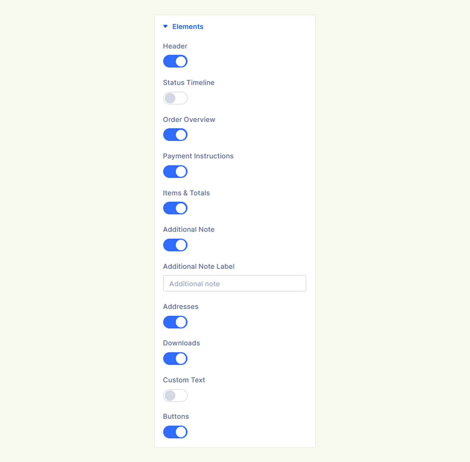
- Header: Show or hide the confirmation heading and message.
- Status Timeline: Display a three-step timeline showing the order's current status. The timeline is hidden for failed, cancelled, or refunded orders.
- Order Overview: Show or hide the order number, date, total, payment method, and available customer information. The email address only appears to the logged-in order owner.
- Payment Instructions: Display information provided by the selected payment gateway. This section only appears when the gateway provides instructions.
- Items & Totals: Show or hide purchased products and the order totals.
- Additional Note: Show or hide an additional note associated with the order.
- Additional Note Label: Customize the heading displayed for the note.
- Addresses: Show or hide the customer's billing and shipping addresses.
- Downloads: Display downloadable files when the order contains downloadable products and WooCommerce allows access to them.
- Custom Text: Show or hide an additional text section.
- Text: Add custom content, such as next steps, an offer, or useful links.
- Buttons: Show or hide the action buttons below the order details.
Section Order #
The Section Order settings let you rearrange enabled sections of the thank-you page. Drag and drop a section to change its position, or use the up and down arrows.
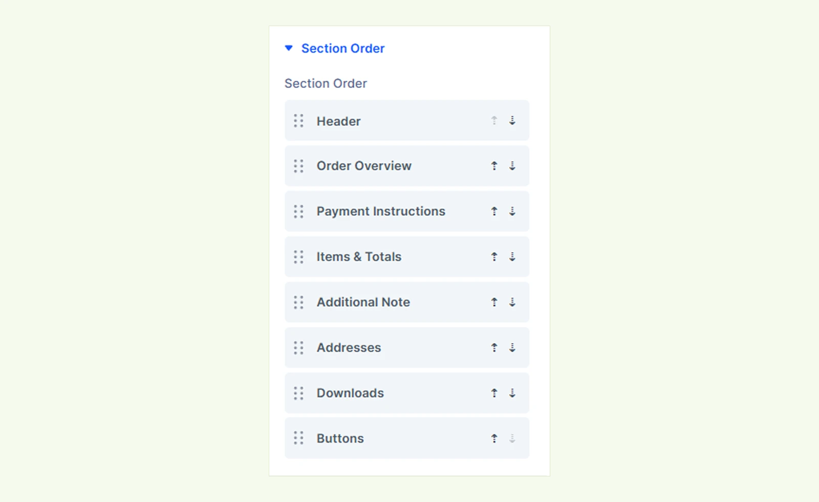
Note: Disabled sections keep their positions and return to those positions when enabled again.
Header #
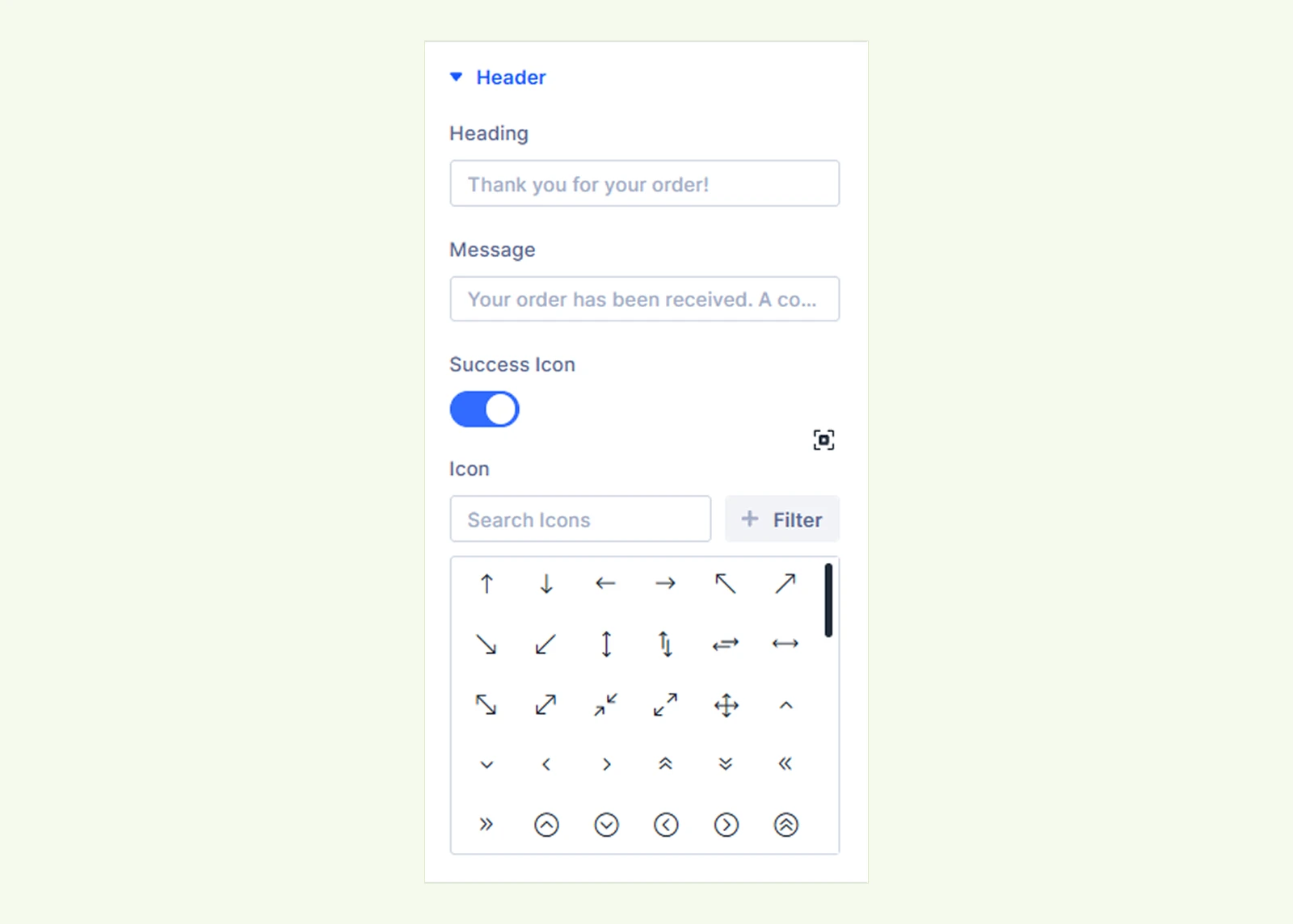
- Heading: Enter a custom heading for the order confirmation. Use {name} to display the customer's billing first name.
- Message: Enter a message to display below the heading. You can also use {name} here.
- Success Icon: Show or hide the success icon above the heading.
- Icon: Choose a custom icon using Divi's icon picker. If none is selected, the default check mark appears.
Note: If the customer has no billing first name, the {name} placeholder is removed automatically.
Failed orders display WooCommerce's payment-failed message and a Pay button instead of the usual confirmation.
Status Timeline #
The Status Timeline settings let you customize the labels of the three order progress steps. (Applies when Elements > Status Timeline is enabled.)
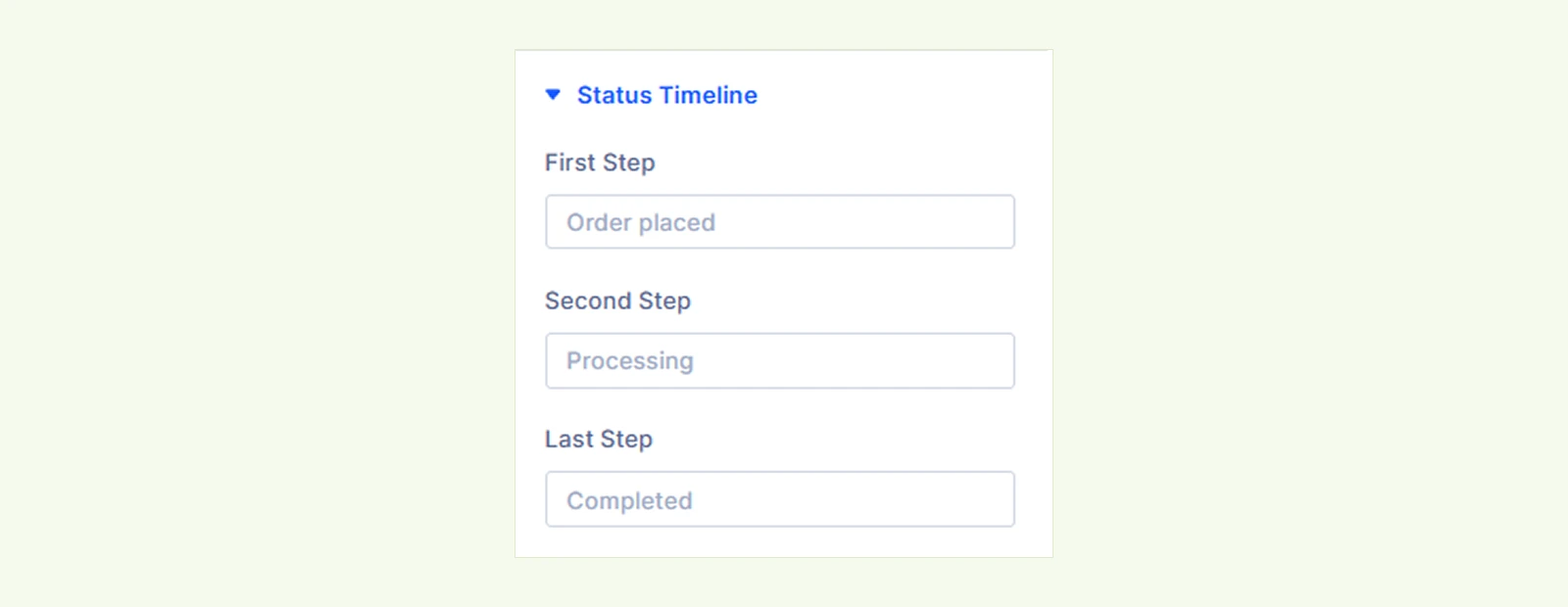
- First Step: Customize the label for the first step, such as Order placed.
- Second Step: Customize the label for the second step, such as Processing.
- Last Step: Customize the label for the final step, such as Completed.
Items & Totals #
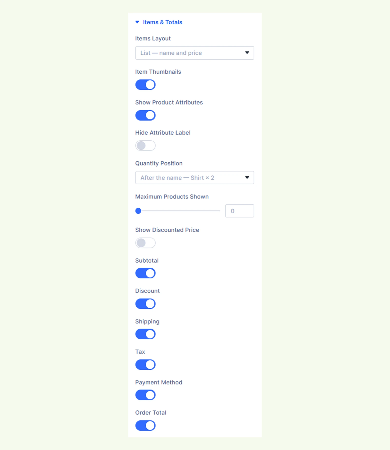
- Items Layout: Choose how purchased products appear. You can choose from:
- List: Display product names, quantities, and prices in a list.
- Images only: Display product thumbnails without the product list.
- Images, then the list: Display product thumbnails followed by a list of product details.
- Item Thumbnails: Show or hide product images in the List layout.
- Show Product Attributes: Display product attributes, such as size and color, and other item details. Not displayed in the Images only layout.
- Hide Attribute Label: Hide attribute labels and display only their values.
- Quantity Position: Choose where product quantities appear.
- After the name: Display the quantity after the product name.
- Before the name: Display the quantity before the product name.
- On the image (badge): Display the quantity as a badge on the product thumbnail. If thumbnails are hidden in the List layout, the quantity appears after the product name. Images only always uses image badges; Images, then the list shows badges on the image strip.
- Maximum Products Shown: Limit how many products appear initially. Set it to 0 to display all products. When a limit is set, customers can expand the remaining items using the + more products control.
- Show Discounted Price: Display a product's price after coupon discounts, with its original price crossed out when applicable.
- Subtotal: Show or hide the subtotal amount.
- Discount: Show or hide the discount amount. (Appears only when a coupon is applied.)
- Shipping: Show or hide shipping charges. (Appears only when the order requires shipping.)
- Tax: Show or hide tax details in the order summary. (Appears only when tax applies to the order. This setting does not affect the order total.)
- Payment Method: Show or hide the payment method in the order totals.
- Order Total: Show or hide the final order amount.
Note: The totals use WooCommerce's order data and can include additional rows added by plugins, such as fees.
Order Details #
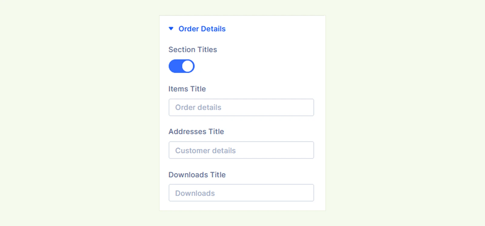
- Section Titles: Show or hide the titles of the Items & Totals, Addresses, and Downloads sections.
- Items Title: Customize the heading above the purchased products and totals.
- Addresses Title: Customize the heading above the billing and shipping addresses.
- Downloads Title: Customize the heading above the downloadable files.
If a title field is left empty, its default heading is used.
Addresses #

- Address Layout: Choose the layout for customer addresses.
- Cards: Display billing and shipping addresses in separate cards side by side.
- Stacked: Display each address in a row with its title beside the details.
- Inline: Display address details in a single line separated by commas.
- Table: Display address details in a table with separate billing and shipping columns.
- Show Labels: Display labels such as City and Postcode beside their values. The Table layout always shows labels.
Note: The shipping address only appears when the order requires shipping and WooCommerce is configured to collect a separate shipping address.
Buttons #
The Buttons settings let you customize the action buttons shown after checkout. They are divided into three tabs:

Continue Shopping Button #
- Continue Button Text: Customize the text displayed on the Continue Shopping button. The button links to your WooCommerce shop page.
My Account Button #
- My Account Button: Show or hide the button that lets customers view the order in their account. (Displayed only to a logged-in customer viewing their own order.)
- My Account Button Text: Customize the text displayed on the My Account button.
Download Button #
- Download Button Text: Customize the text displayed beside downloadable files. (Displayed when the order has downloadable products and WooCommerce allows access to the files.)
Note: The Visual Builder previews the most recent order, or sample details if no orders exist. Customers see their own order information on the live page.
Background: Customize the background of the entire module using Divi's standard background settings.
Element Label: Set a custom admin label to easily identify the module in the Divi Builder.
Design Tab #
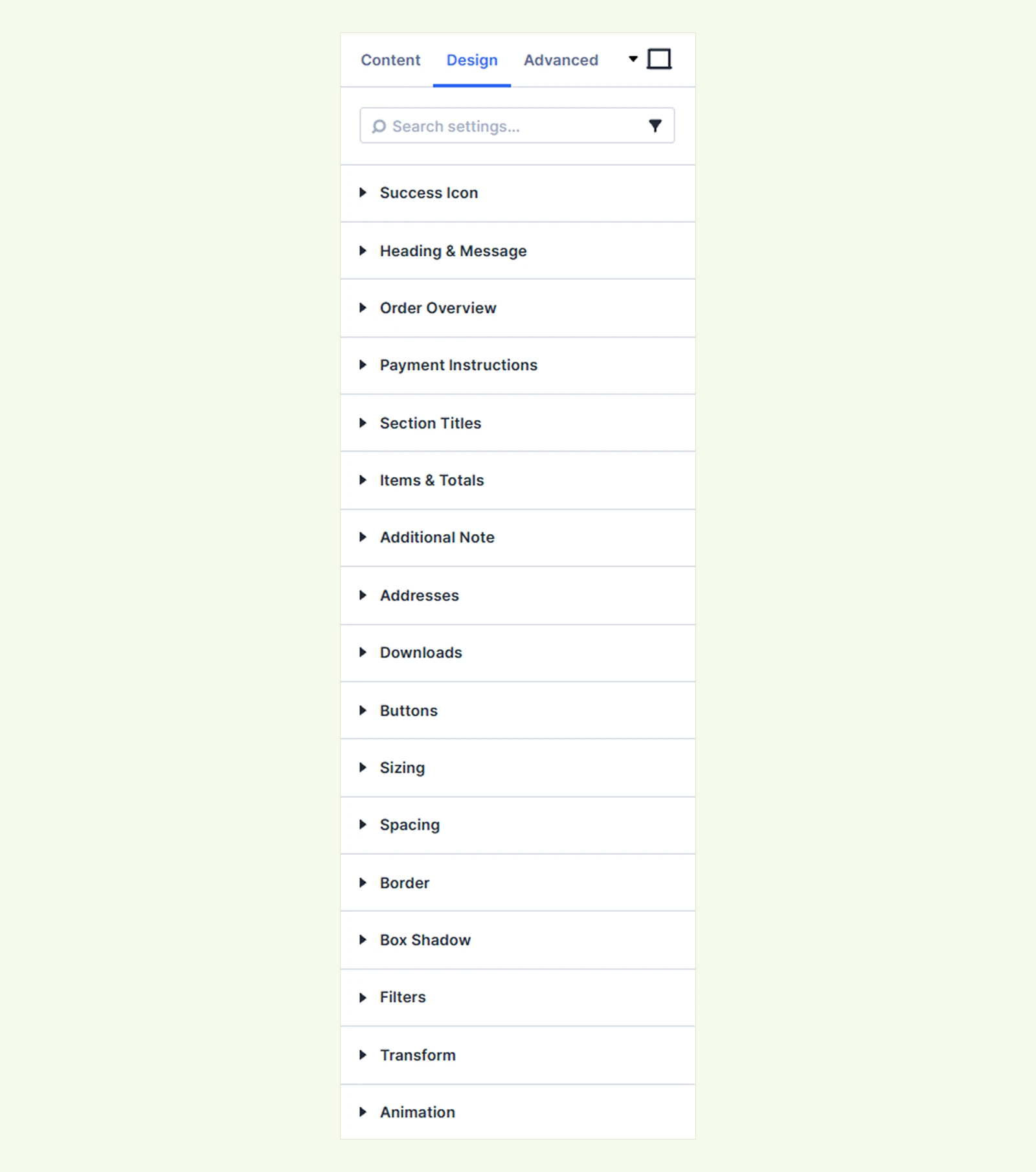
The Design tab lets you customize the appearance of the success icon, confirmation message, timeline, order details, product list, addresses and more.
Success Icon #
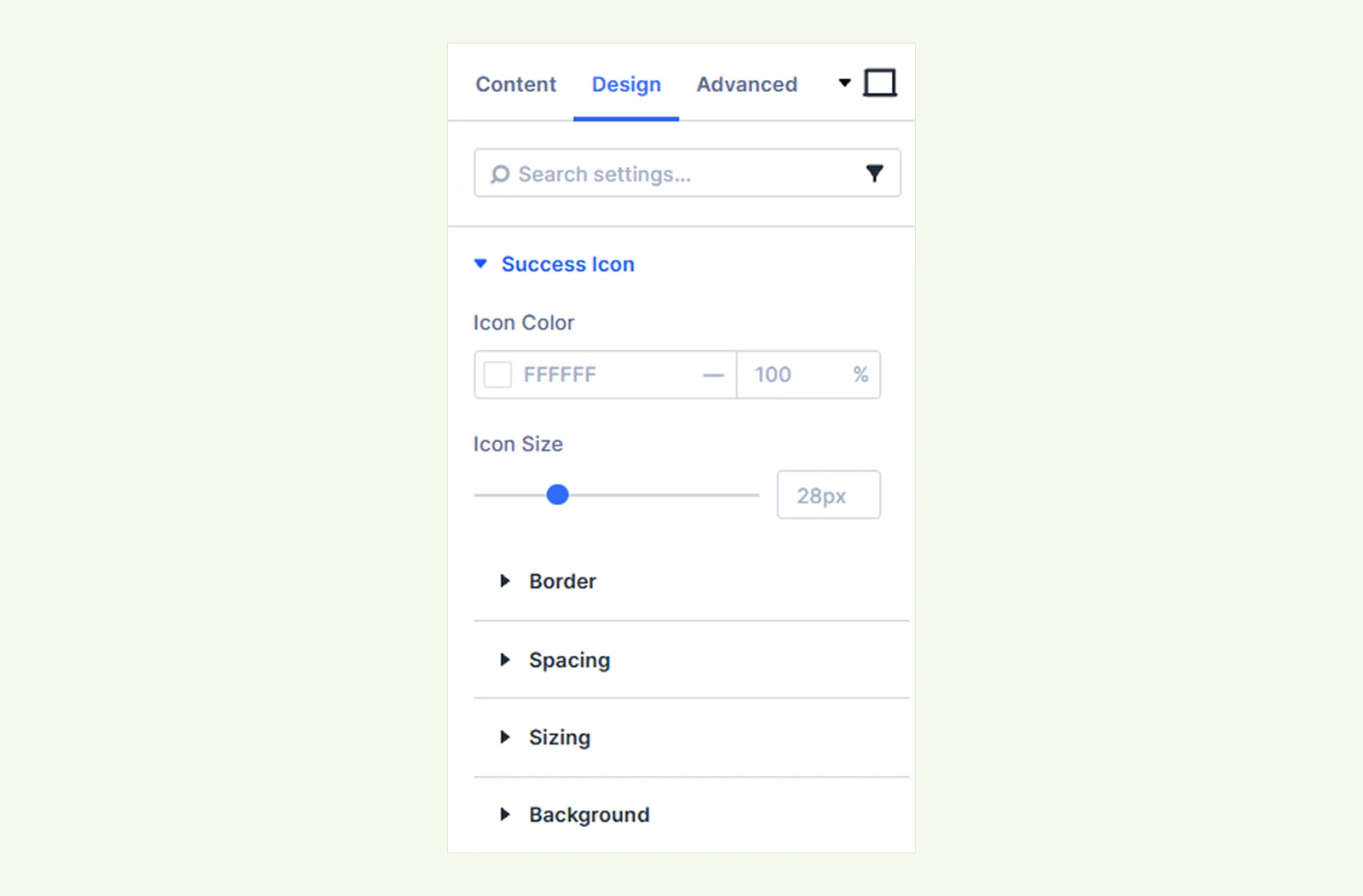
- Icon Color: Customize the color of the check mark or selected icon.
- Icon Size: Adjust the size of the icon.
You can also customize the icon area's sizing, spacing, border, and background.
Heading & Message: Customize the typography and spacing of the confirmation heading and message.
Status Timeline #
Customize the timeline's colors and appearance. (Available when Status Timeline is enabled.)
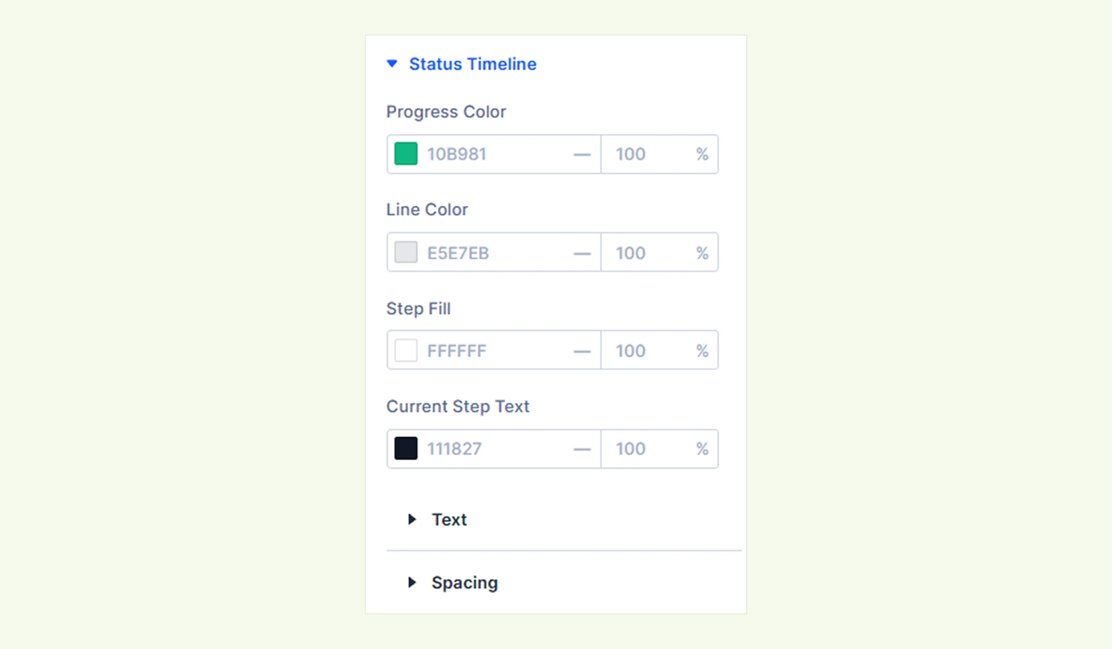
- Progress Color: Set the color of completed and current steps and the progress line.
- Line Color: Customize the color of the remaining progress line.
- Step Fill: Set the background color of the timeline step indicators.
- Current Step Text: Customize the text color of the current step.
You can also customize the step labels' typography and timeline spacing.
Order Overview: Customize label and value typography, along with the overview items' background, border, and spacing.
Payment Instructions: Customize the typography, background, border, and spacing of payment instructions.
Section Titles: Customize the typography and spacing of the Items & Totals, Addresses, and Downloads section headings.
Items & Totals: Customize product information, thumbnails, quantity badges, attributes, and order totals across five tabs using typography, sizing, background, border, and spacing settings.
Addresses #
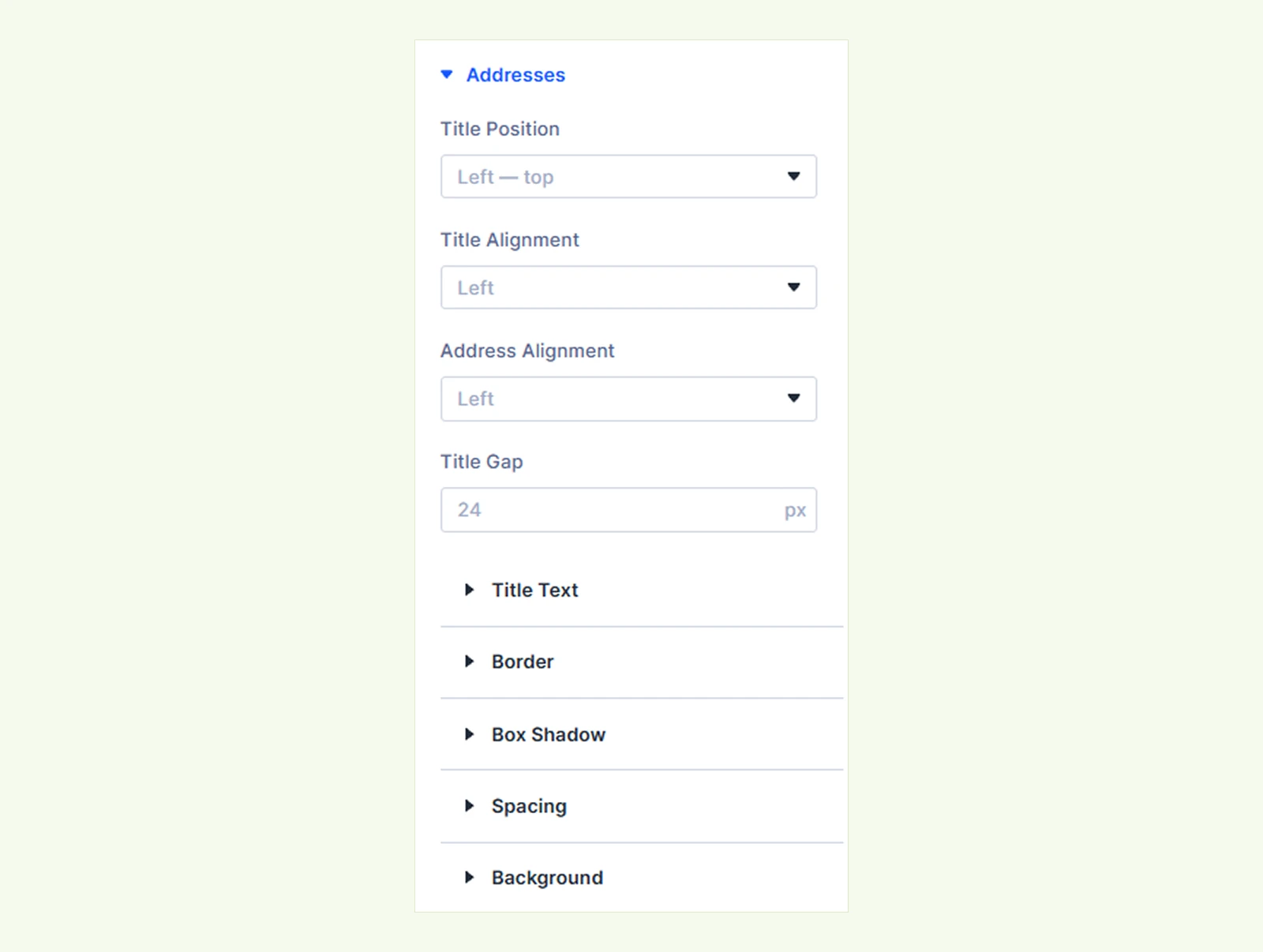
- Title Position: Place the address title above or beside its details (top, center, or bottom). On mobile, it appears above. (Stacked layout only.)
- Title Alignment: Align the address title left, center, or right. (Stacked layout only.)
- Address Alignment: Align the address details left, center, or right. (Stacked layout only.)
- Title Gap: Set the space between the title and details. Use auto to push them apart. (Stacked layout only.)
- Table Divider Color: Set the color of the lines between address rows. (Table layout only.)
- Table Divider Style: Choose Solid, Dashed, Dotted, Double, or None for the divider lines. (Table layout only.)
You can also customize the typography, background, border, spacing, and box shadow of billing and shipping addresses
Downloads: Customize the file name typography, border, spacing, and background of download rows.
Buttons: Customize the typography, background, border, spacing, and box shadow of the Continue Shopping, My Account, and Download buttons in their respective tabs.
Custom Text: Customize the typography of additional text content. (Available when Custom Text is enabled.)
Background: Customize the background of the entire module.
Sizing: Adjust the width, height, and alignment of the module.
Spacing: Customize the margin and padding around the module.
Border: Customize the module's border style, width, and color.
Box Shadow: Add and customize shadow effects around the module.
Filters: Apply color filters to adjust the module's appearance.
Transform: Scale, rotate, move, or skew the module.
Animation: Add animation effects and customize their type, duration, delay, and repeat settings.
Advanced Tab #
The Advanced tab provides additional controls, including Position, Visibility, Conditions, and other standard Divi settings. This module does not include module-specific Custom CSS fields.
Need Help? #
If you have any questions or need assistance, contact our support team: [email protected].


