
The DiviMerc Product Grid module displays WooCommerce products in a grid on your website. Each product appears in its own card with an image, name, price, and other details you choose. You can customize the cards and the grid layout in the Divi Visual Builder.
Important Note:
- Product Grid is enabled by default. You can manage it from DiviMerc > Modules > Product Grid.
- WooCommerce must be active, and you need published products that match the selected Product Source.
Content Tab #
The Content tab lets you choose which products to display and control what appears on each card.
Content #
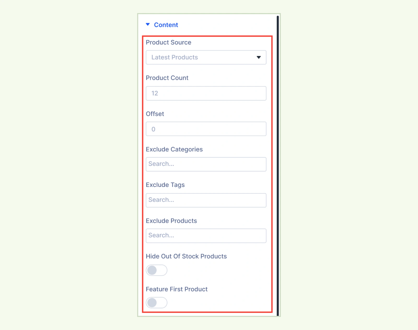
- Product Source: Choose from All Products, Latest Products, Featured Products, On Sale, Best Selling, Top Rated, Specific Category, Specific Tags, Specific Products, Use Current Loop, Related Products, Upsells, or Cross-sells. The default is Latest Products.
- Included Categories: Select the categories to display. Selecting a parent category also includes its child categories. (Available when Product Source is set to Specific Category.)
- Included Tags: Select the product tags to include. (Available when Product Source is set to Specific Tags.)
- Included Products: Search for and select products by name. The grid stays empty until you select a product. (Available when Product Source is set to Specific Products.)
- Product Count: Set the number of products per page. The default is 12, and the maximum is 48.
- Offset: Skip a set number of products at the beginning of the list.
- Order By: Set the order products appear in the grid. (Hidden for Latest Products, Best Selling, and Top Rated, which set their own order. And a shopper’s Sort by choice in Product Filter takes priority.)
- Exclude Categories: Leave out products in the selected categories.
- Exclude Tags: Leave out products with the selected tags.
- Exclude Products: Search for and select products to leave out.
- Hide Out of Stock Products: Remove out-of-stock products from this grid.
- Feature First Product: Make the first card on each page span two columns. (The card keeps its normal width on phones and in single-column layouts.)
Elements #
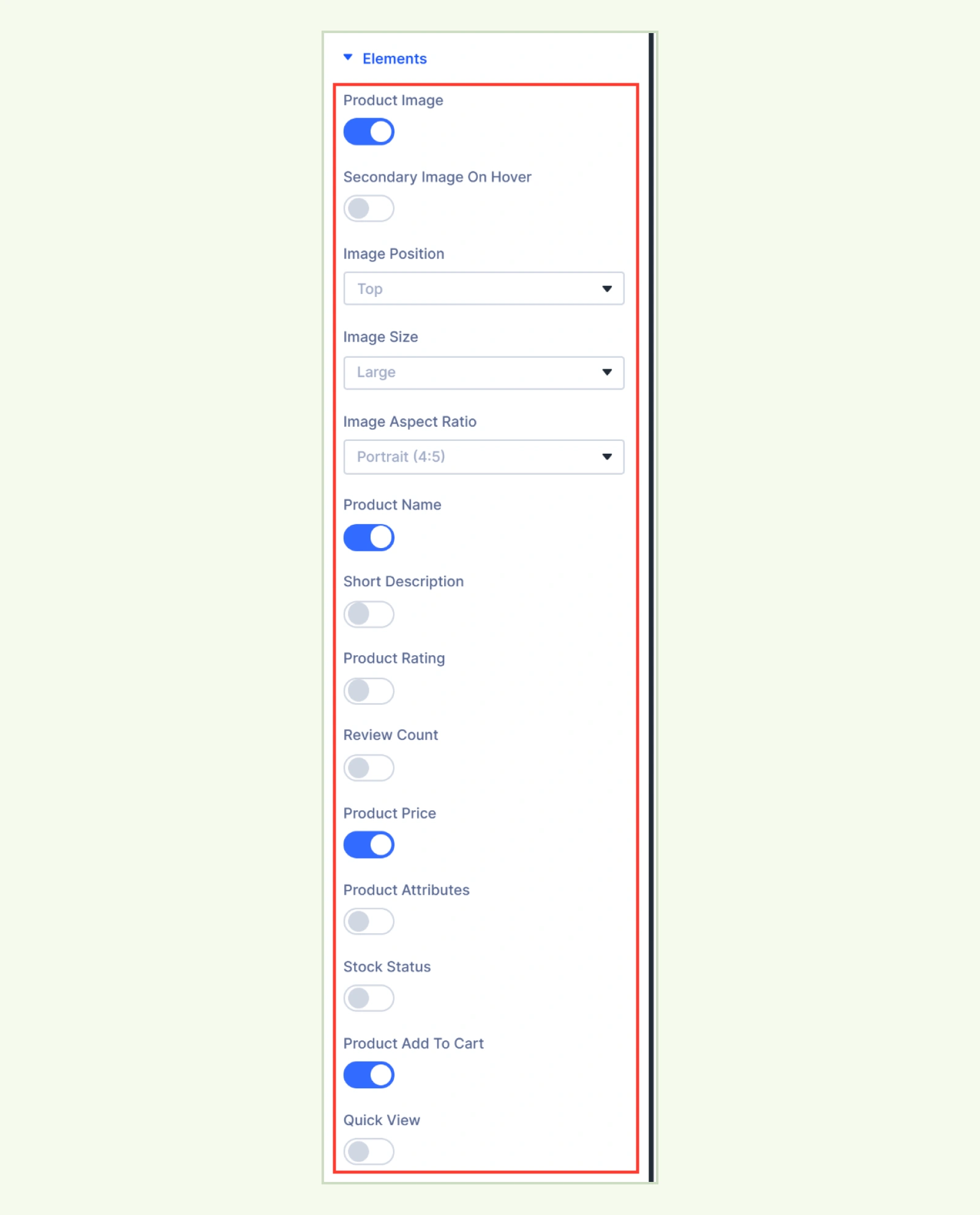
- Product Image: Show the product image and link it to the product page.
- Secondary Image on Hover: Show the first gallery image when the card is hovered. Products without gallery images keep their main image.
- Image Position: Place the image at the Top, Left, or Right of the card. You can set a different position for each device.
- Image Size: Choose Medium, Medium Large, Large, or Full.
- Image Aspect Ratio: Choose Original, Square (1:1), Portrait (4:5, 3:4, or 2:3), Landscape (4:3 or 3:2), Wide (16:9), or Custom.
- Custom Image Aspect Ratio: Enter a ratio such as 5/4 or 5:4. (Available when Image Aspect Ratio is set to Custom.)
- Product Name: Show the product name and link it to the product page.
- Short Description: Show the product’s short description as plain text.
- Description Length: Set the length from 0 to 80 words. Enter 0 to show the full description.
- Product Rating: Show the star rating. (Appears on products with reviews.)
- Review Count: Show how many reviews the product has.
- Count Format: Customize the review count using {count}, {label}, and {rating}. The default is ({count} {label}).
- Product Price: Show the WooCommerce price, including a price range for variable products and the struck-through regular price for sale products.
- Product Attributes: Show attribute names and values, such as “Color: Red, Blue.”
- Stock Status: Show the product’s WooCommerce availability, such as “10 in stock” or “Out of stock.”
- Product Add To Cart: Show the WooCommerce action button. Its label and action depend on the product type and availability.
- Quick View: Show a button that opens the product in a popup. (Requires the Quick View extension under DiviMerc > Extensions.)
Meta #
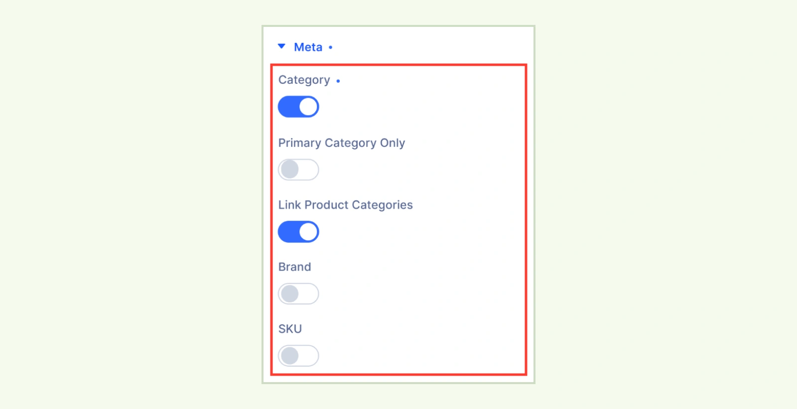
- Category: Show the product’s categories.
- Link Product Categories: Link each category to its archive.
- Primary Category Only: Turn this on to show only the product’s parent category. Turn it off to show subcategories as well.
- Brand: Show the product’s brand and link it to its archive. (Appears on products with a brand assigned.)
- Product SKU: Show the product’s SKU.
Badges #
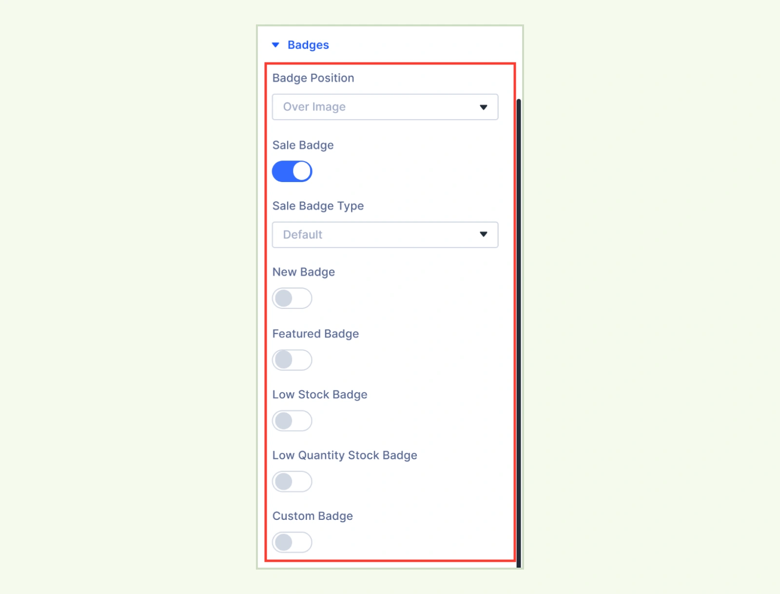
- Badge Position: Choose Over Image to place badges over the image or On Content to place them with the card details. (When Product Image is disabled, over-image badges sit at the top of the card.)
- Sale Badge: Show a badge on products on sale. This is the only badge enabled by default.
- Sale Badge Type: Choose Default for “Sale,” Discount Percent for a percentage, or Save Amount for an amount. Variable products use the largest discount and add “Up to” when variation discounts differ.
- New Badge: Show a “New” badge on recently published products.
- New Badge Days: Set how long a product is considered new, from 1 to 365 days. The default is 30 days.
- Featured Badge: Show a “Featured” badge on products marked as featured.
- Low Stock Badge: Show a “Low Stock” badge on in-stock products that manage inventory and have reached their WooCommerce low stock threshold.
- Low Quantity Stock Badge: Show the remaining quantity, such as “Only 3 left.” (Uses the same stock conditions as Low Stock Badge.)
- Custom Badge: Display the text from the Product Badge module’s Custom Badge Text field under Product data > General. (Appears on simple or variable products when the field has text.)
Add To Cart Action & Behaviour #
This section appears when Product Add To Cart is enabled.
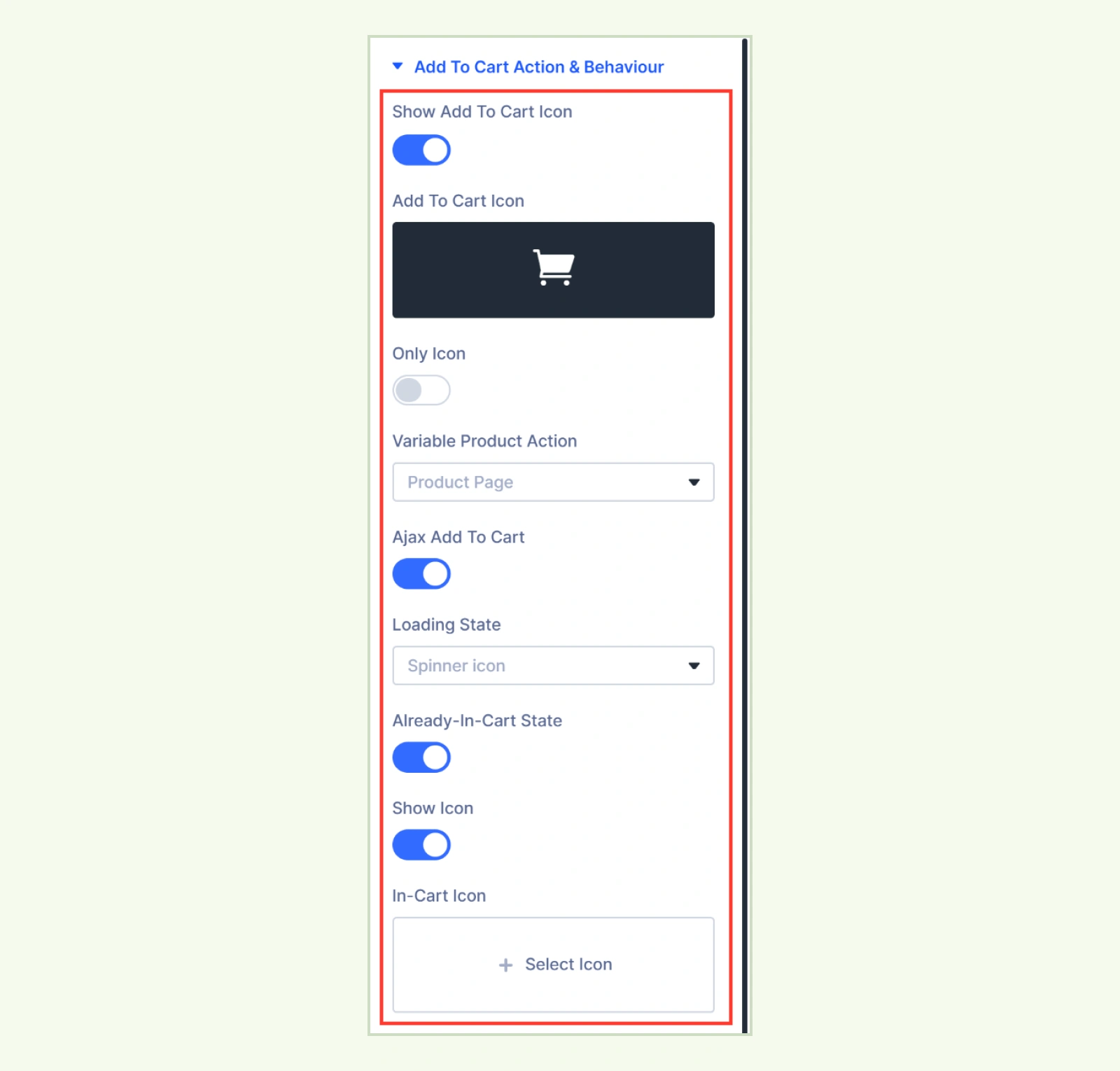
- Show Add To Cart Icon: The button shows a cart icon before the text by default.
- Add To Cart Icon: Choose a different icon.
- Only Icon: Hide the visible button text while keeping it available to screen readers.
- Out of Stock Icon: Choose an icon for out-of-stock products or variations. The default is a cross.
- Variable Product Action: Choose what happens when shoppers click Select options. Product Page is the default. Quick View opens a popup and requires the Quick View extension.
- Ajax Add To Cart: Add simple products and variations selected through card swatches without reloading the page. Enabled by default.
- Loading State: Show a spinner or text while the product is being added. The spinner is the default.
- Loading Text: Customize the message shown when Text is selected. The default is Adding….
- Loading State: Show a spinner or text while the product is being added. The spinner is the default.
- Already-In-Cart State: Show In cart or a custom label from Add to Cart Labels & Rules when the product or selected variation is already in the cart. Clicking the button opens the product page. Enabled by default.
- Show Icon: Replace the regular button icon with a checkmark by default.
- In-Cart Icon: Choose a different icon when Show Icon is enabled.
- Show Icon: Replace the regular button icon with a checkmark by default.
Variation Swatches #
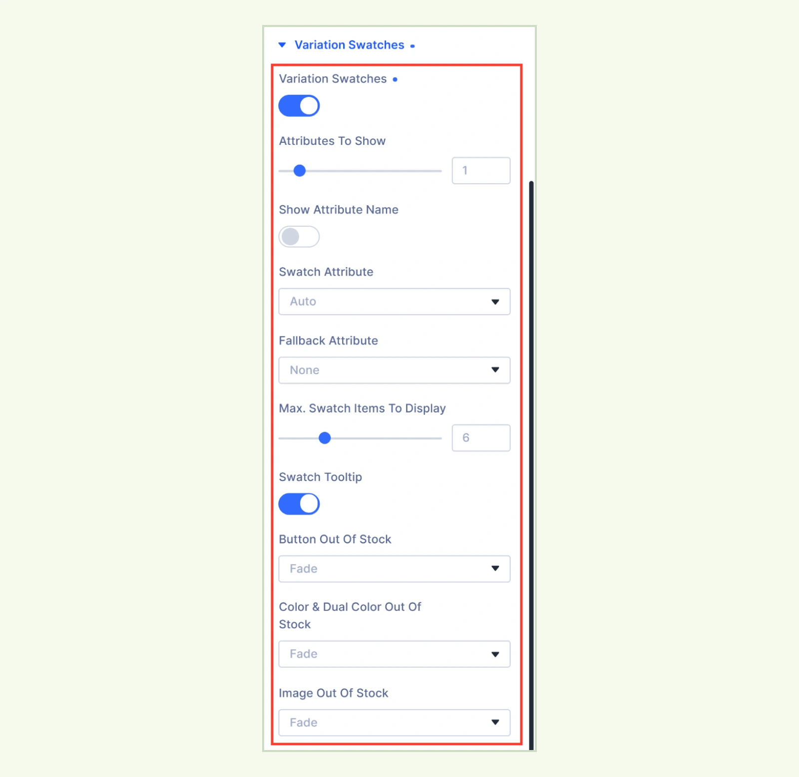
- Variation Swatches: Show options like color or size on variable product cards. Selecting a swatch updates the image and price. If the selection matches a single variation, it also updates the SKU and stock status.
- Attributes to Show: Set how many variation attributes to display, from 0 to 10. Enter 0 to show all attributes.
- Show Attribute Name: Show the attribute name above each row of swatches.
- Swatch Attribute: Choose a global attribute. Auto uses the first configured color or image attribute. (Available when Attributes to Show is set to 1.)
- Fallback Attribute: Choose an attribute to use when a product lacks the selected swatch attribute. (Available when Attributes to Show is set to 1.)
- Max. Swatch Items to Display: Set how many swatches to show per row, from 1 to 20. Additional options appear as a +N link to the product page.
- Swatch Tooltip: Show the configured tooltip or the value name on hover and keyboard focus.
- Button Out of Stock: Choose Fade, Cross (X), Diagonal line, Strikethrough, or Hide for out-of-stock button swatches.
- Color & Dual Color Out of Stock: Choose Fade, Cross (X), Diagonal line, or Hide for out-of-stock color swatches.
- Image Out of Stock: Choose Fade, Cross (X), Diagonal line, or Hide for out-of-stock image swatches.
Note: When all variation attributes are shown and a shopper selects an in-stock variation, they can add it to the cart from the card if Product Add To Cart is enabled.
Quick View #
This setting group appears when Quick View is enabled under Elements or when Product Add To Cart is enabled and Variable Product Action is set to Quick View. If the extension is disabled, the group shows a notice in place of its settings.
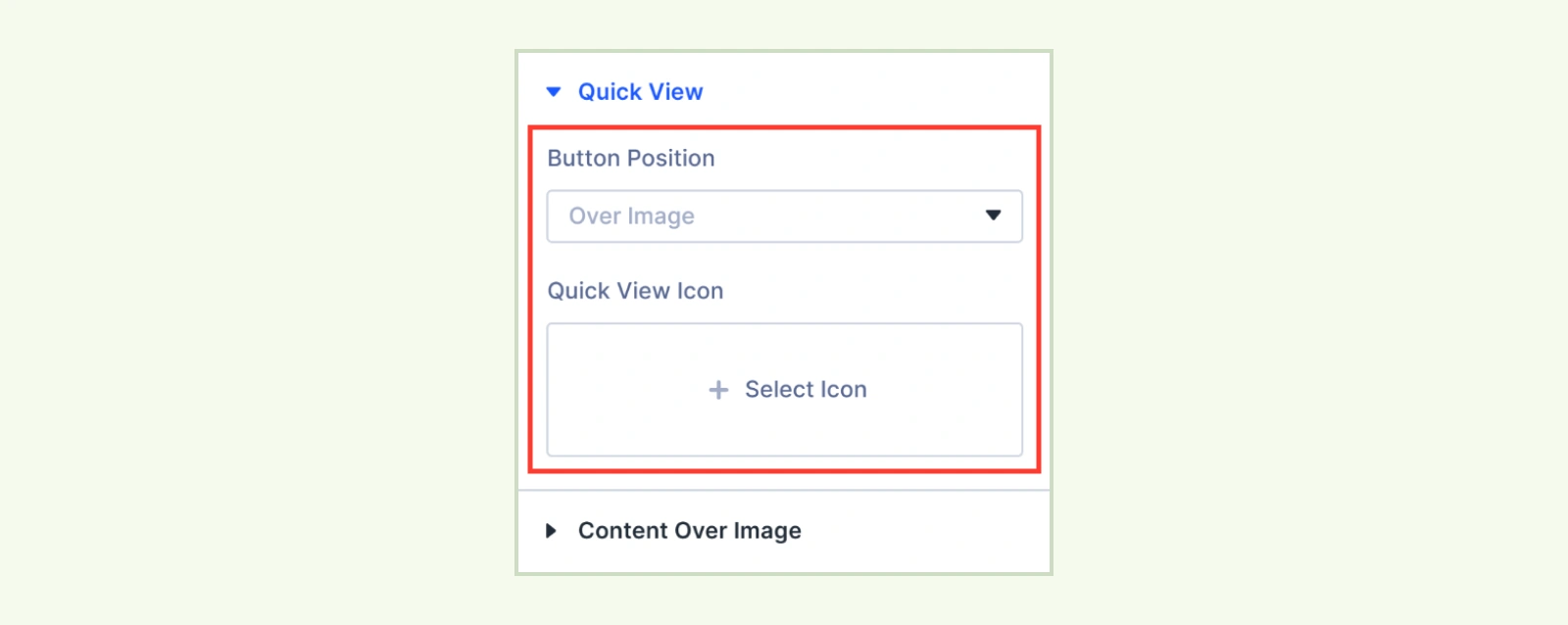
- Button Position: Choose Over Image, On Image Hover, or With Buttons. (If the card has no product image, the Quick View button appears in the card’s button area.)
- Quick View Icon: Choose the icon for the round Quick View button. (Available when Button Position is set to Over Image or On Image Hover.)
- Quick View Text: Enter the text for the Quick View button. (Available when Button Position is set to With Buttons.)
Note: To edit the popup layout, go to DiviMerc > Extensions > Quick View > Configure > Quick View Layout.
Content Over Image #
This setting group appears when Product Image is enabled.
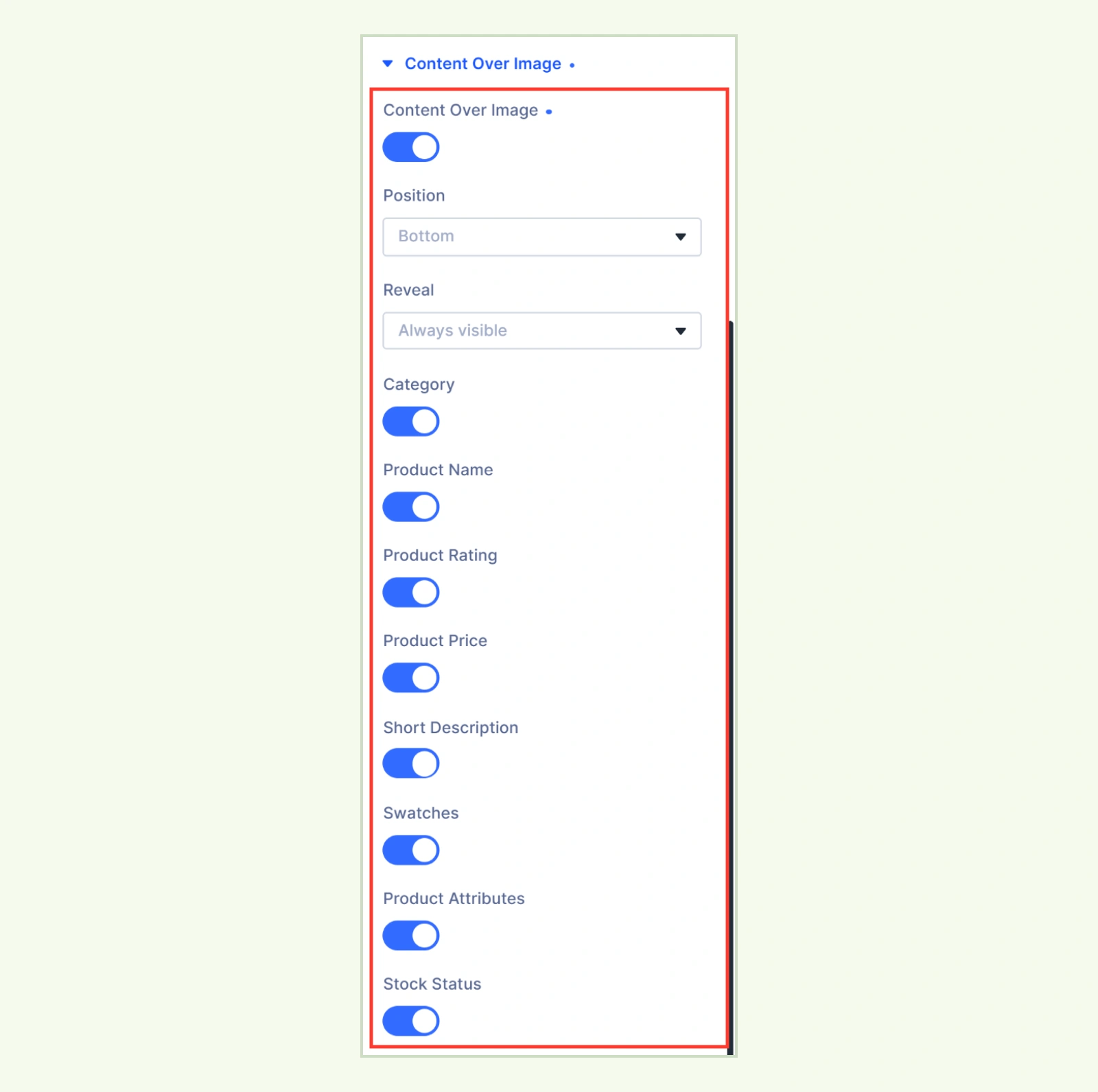
- Content Over Image: Enable this to place selected card details over the product image. (This group appears when Product Image is enabled.)
- Position: Place the details at the Bottom, Middle, or Top of the image.
- Reveal: Choose Always visible or On hover. With On hover, the details also appear on keyboard focus and stay visible on touch devices.
- Minimum Height: Set the minimum image height for each device. (Available when Image Aspect Ratio is set to Original.)
- Individual element toggles: Turn on a toggle to show that detail over the image. Turn it off to keep the detail in the card’s details area. (Each toggle appears when the corresponding element is included in the card.)
Element Order #
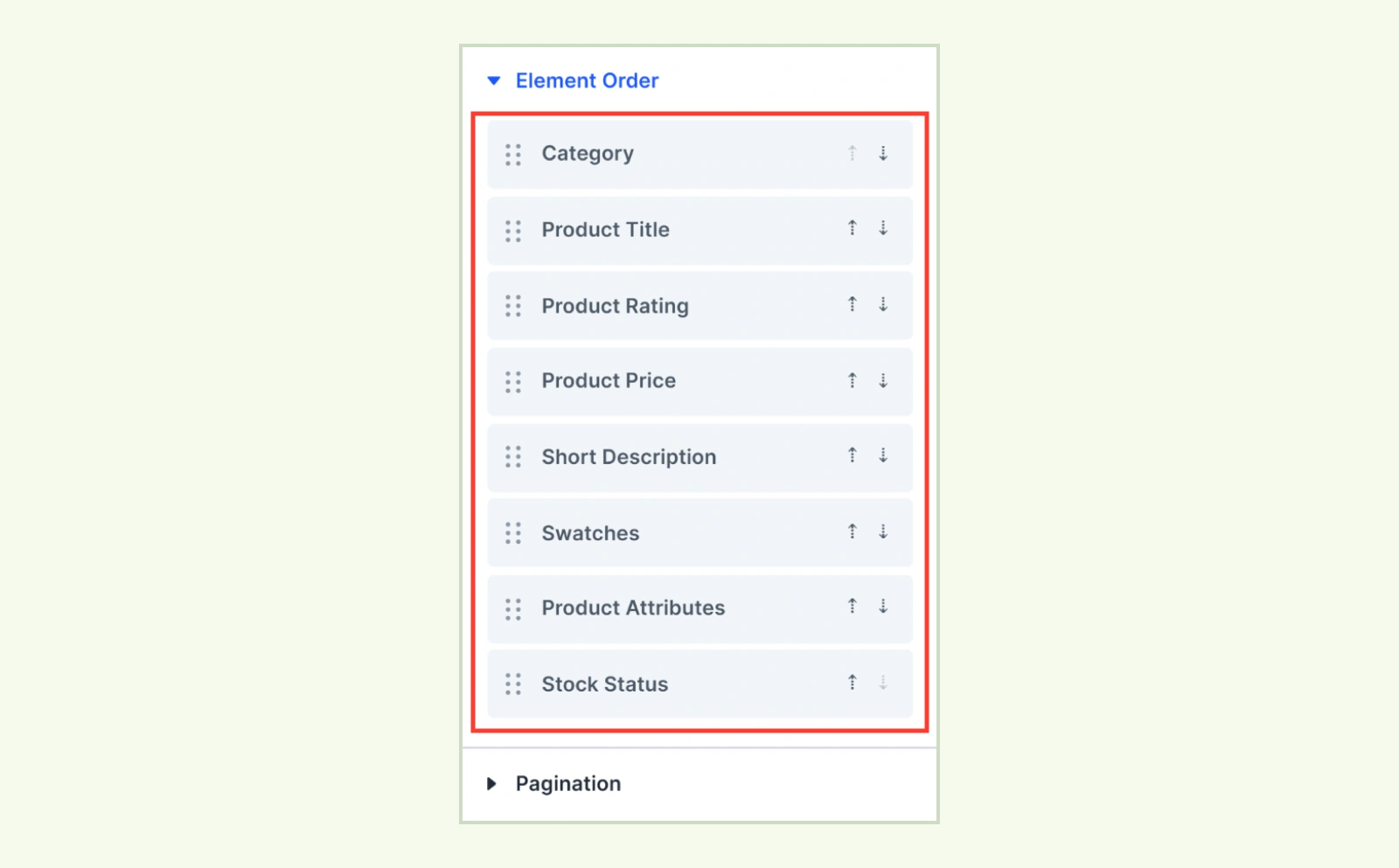
- Element Order: Drag enabled card elements to reorder them, or use the up and down arrows. The same order applies to details shown over the image.
- Badges: Appear in the list when at least one badge is enabled and Badge Position is set to On Content.
- Buttons: Appear in the list when Product Add To Cart is enabled or Quick View is enabled with Button Position set to With Buttons. (Hidden from the list when Button Display is set to On Image Hover.)
Pagination #
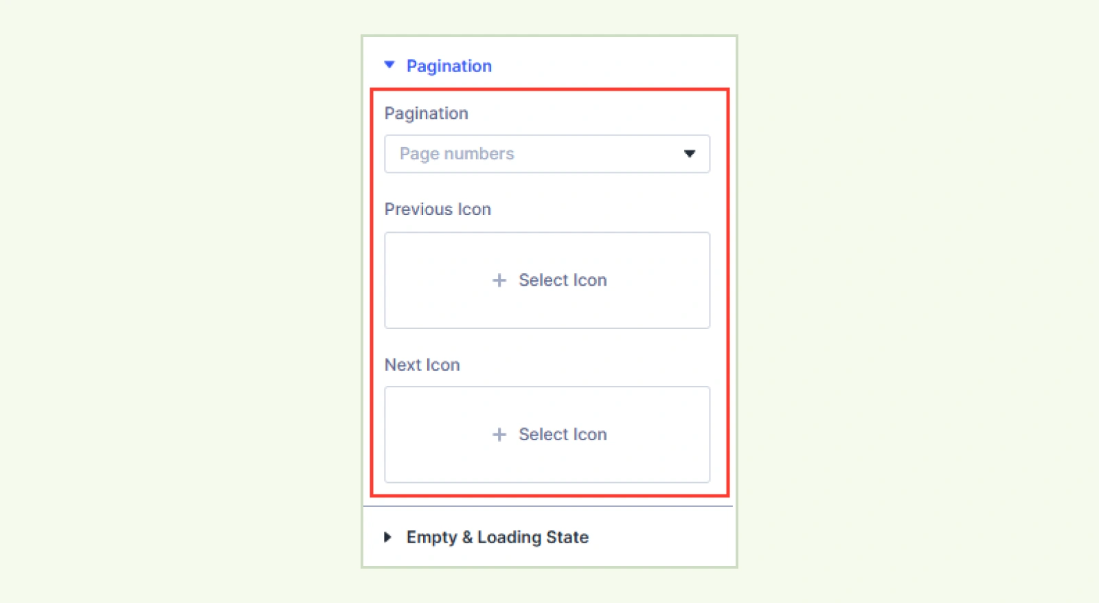
- Pagination: Choose Page numbers, Previous / Next buttons, Load more button, Infinite scroll, or None. Products load without a page reload.
- Button Content: Choose Label & Icon, Label only, or Icon only. (Available with Previous / Next buttons.)
- Previous Label: Enter the text for the Previous button. (Available with Previous / Next buttons when Button Content includes a label.)
- Next Label: Enter the text for the Next button. (Available with Previous / Next buttons when Button Content includes a label.)
- Previous Icon: Choose the Previous icon. Leave it empty to use the default chevron. (Available with Page numbers or with Previous / Next buttons when Button Content includes an icon.)
- Next Icon: Choose the Next icon. Leave it empty to use the default chevron. (Available with Page numbers or with Previous / Next buttons when Button Content includes an icon.)
- Load More Label: Enter the text for the Load more button. (Available with Load more button.)
- Loading Text: Enter the message shown while more products load. (Available with Infinite scroll.)
Empty & Loading State #
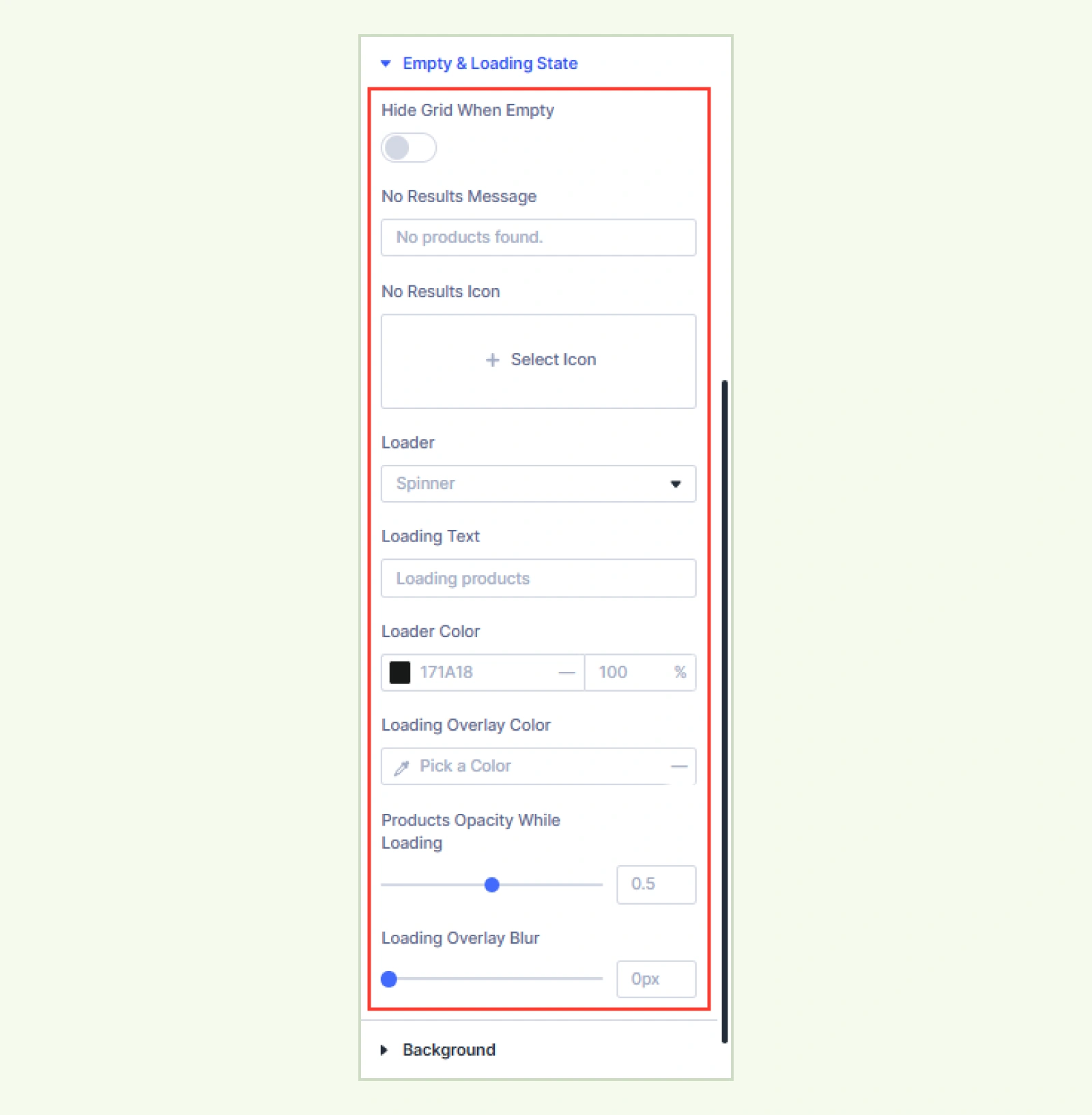
- Hide Grid When Empty: Hide the grid on the live page when the selected product source has no products to show. The grid stays visible in the Visual Builder. If shoppers filter the grid and find no matches, they still see the No Results Message.
- No Results Message: Enter the message shown when there are no products to display. The default is “No products found.”
- No Results Icon: Choose an icon to display above the no-results message.
- Loader: Choose Spinner, Dots, Bar, or None. With None, the products fade while loading. A connected Product Filter’s loader takes priority if one is configured.
- Loading Text: Enter the text screen readers announce while products load. (Available when Loader is set to Spinner, Dots, or Bar.)
- Loader Color: Set the loader color for each device. (Available when Loader is set to Spinner, Dots, or Bar.)
- Loading Overlay Color: Set the color displayed over the products while they load.
- Products Opacity While Loading: Adjust how much the products fade while loading. Set it to 1 for full opacity.
- Loading Overlay Blur: Adjust how much the products blur while loading, from 0 to 20px.
Background: Customize the background of the entire module using Divi’s standard background settings.
Element Label: Set a custom label to identify the module in the Divi Visual Builder.
Design Tab #
The Design tab lets you style the grid and its card elements. Design groups for optional elements appear when the corresponding elements are enabled.
Layout: Set the grid’s columns, rows, gaps, and alignment for each device. The default grid uses four columns on desktop, two on tablet, and one on phone, with 14px gaps.
Item Card #
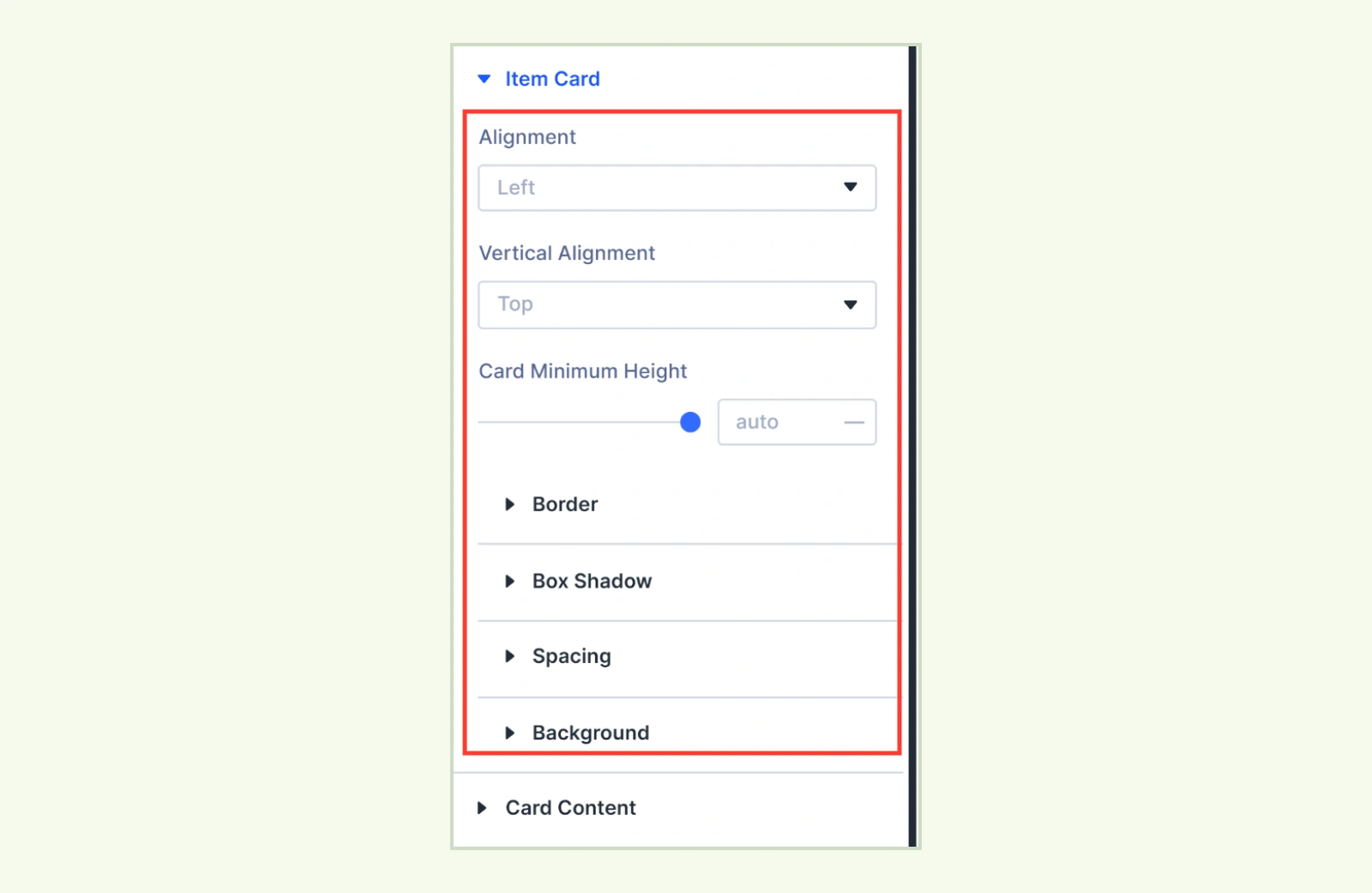
- Alignment: Align the card details to the Left, Center, or Right.
- Vertical Alignment: Place the card details at the Top, Middle, or Bottom. Choose Space Between to keep the details at the top and push the buttons to the bottom.
- Card Minimum Height: Set a minimum card height for each device.
You can also customize the card’s border, box shadow, spacing, and background.
Card Content:Customize the border, spacing, and background of the details area below or beside the product image.
Overlay: Customize the border, spacing, and background of the details area over the product image. (Available when Product Image and Content Over Image are enabled.)
Image #
This group appears when Product Image is enabled.
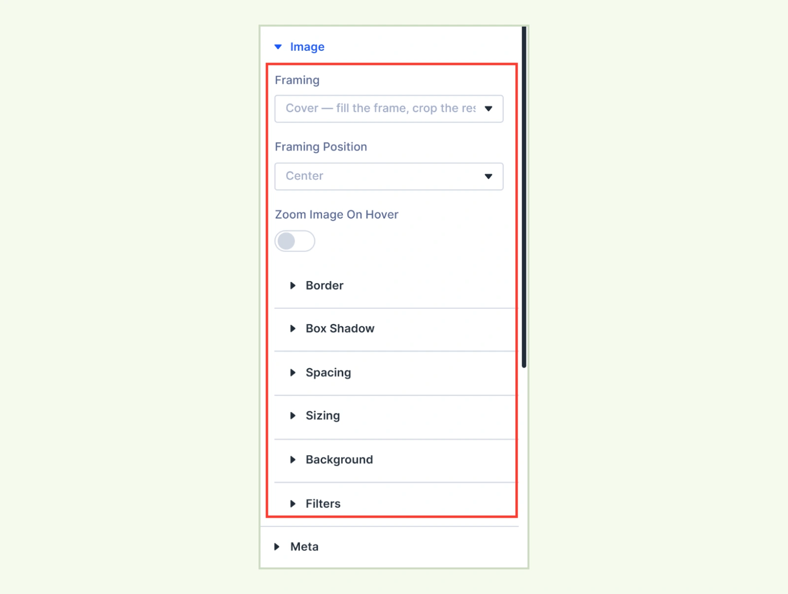
- Framing: Choose Cover, Contain, Stretch, No framing, or Scale down only.
- Framing Position: Choose which part of the image stays in view when cropped.
- Zoom Image On Hover: Slightly zoom the image when the card is hovered or focused. (Disabled on touch screens and when reduced motion is enabled.)
You can also customize the image’s border, box shadow, spacing, sizing, background, and filters.
Meta: Customize the text and spacing for product categories and brands. You can also style the SKU label and value separately and adjust the spacing around the SKU. (Available when Category, Brand, or Product SKU is enabled.)
Badges #
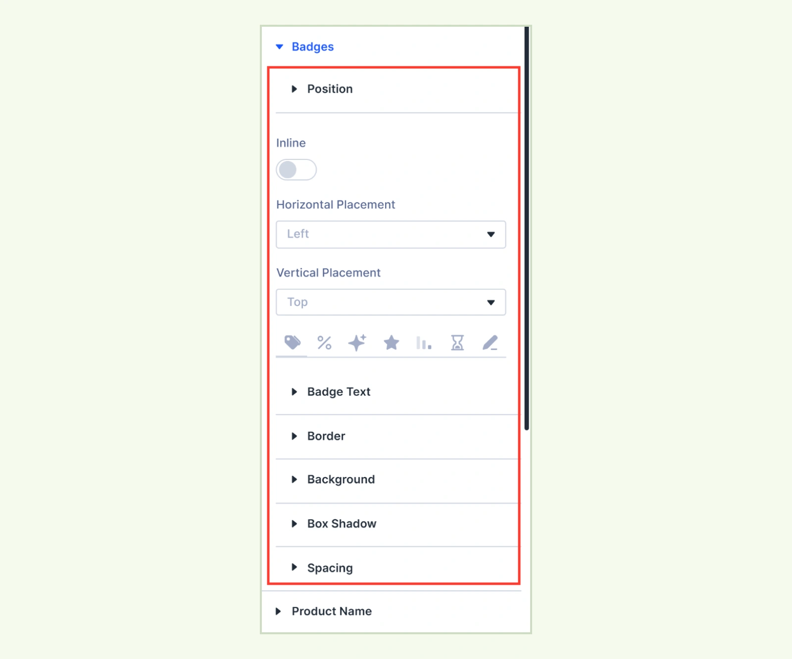
- Inline: Show badges side by side and wrap them when needed. Turn it off to stack them. (Available when Badge Position is set to Over Image.)
- Horizontal Placement: Place badges on the Left, Center, or Right. (Available when Badge Position is set to Over Image.)
- Vertical Placement: Place badges at the Top, Center, or Bottom. (Available when Badge Position is set to Over Image.)
Use All Badges to apply shared styles. Use the Sale, New, Featured, Low Stock, Low Quantity, or Custom tab to override the text, border, or background for a specific badge.
Product Name: Customize the product name typography and spacing. (Available when Product Name is enabled.)
Review & Rating #
This group appears when Product Rating or Review Count is enabled.
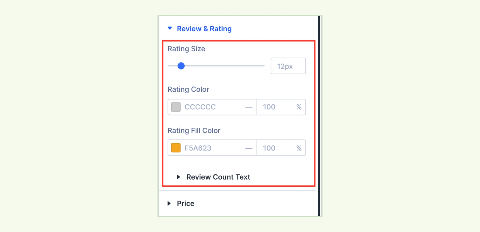
- Rating Size: Adjust the size of the rating stars.
- Rating Color: Set the color of the unfilled stars.
- Rating Fill Color: Set the color of the filled stars.
- Review Count Text: Customize the review count typography.
Price: Customize the typography and spacing of the product price. You can style the sale price and the crossed-out regular price separately. (Available when Product Price is enabled.)
Short Description: Customize the description typography and spacing. (Available when Short Description is enabled.)
Variation Swatches #
This group appears when Variation Swatches is enabled.
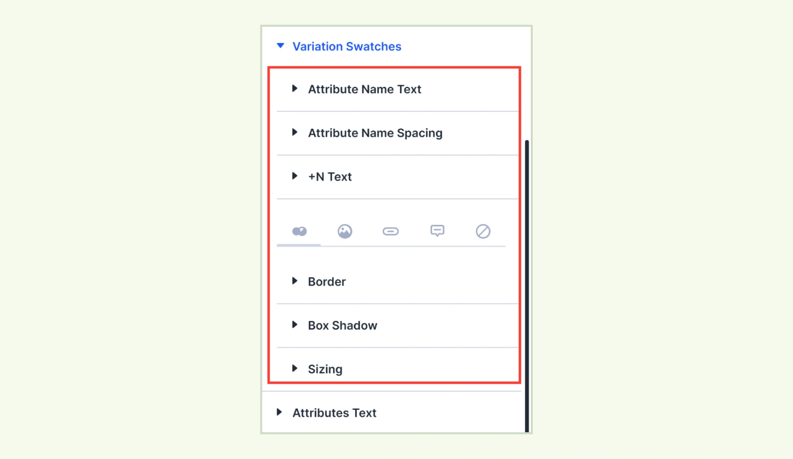
- Attribute Name Text: Customize the attribute name typography. (Available when Show Attribute Name is enabled.)
- Attribute Name Spacing: Adjust the spacing around the attribute name. (Available when Show Attribute Name is enabled.)
- +N Text: Style the text that indicates additional swatches.
- Color & Dual Color: Style the size, border, and shadow of color swatches.
- Image: Style the size, border, and shadow of image swatches.
- Button: Style the text, background, spacing, border, and shadow of button swatches.
- Tooltip: Style the tooltip text, background, and arrow.
- Out of Stock: Set the opacity and cross or line color for out-of-stock swatches.
Attributes Text: Style the attribute labels, values, and spacing. (Available when Product Attributes is enabled.)
Stock Text: Style the stock status text, out-of-stock text, and spacing. (Available when Stock Status is enabled.)
Button Container: Adjust the spacing around the button row. (Available when Product Add To Cart is enabled or Quick View is set to With Buttons.)
Add To Cart Button #
This group appears when Product Add To Cart is enabled.
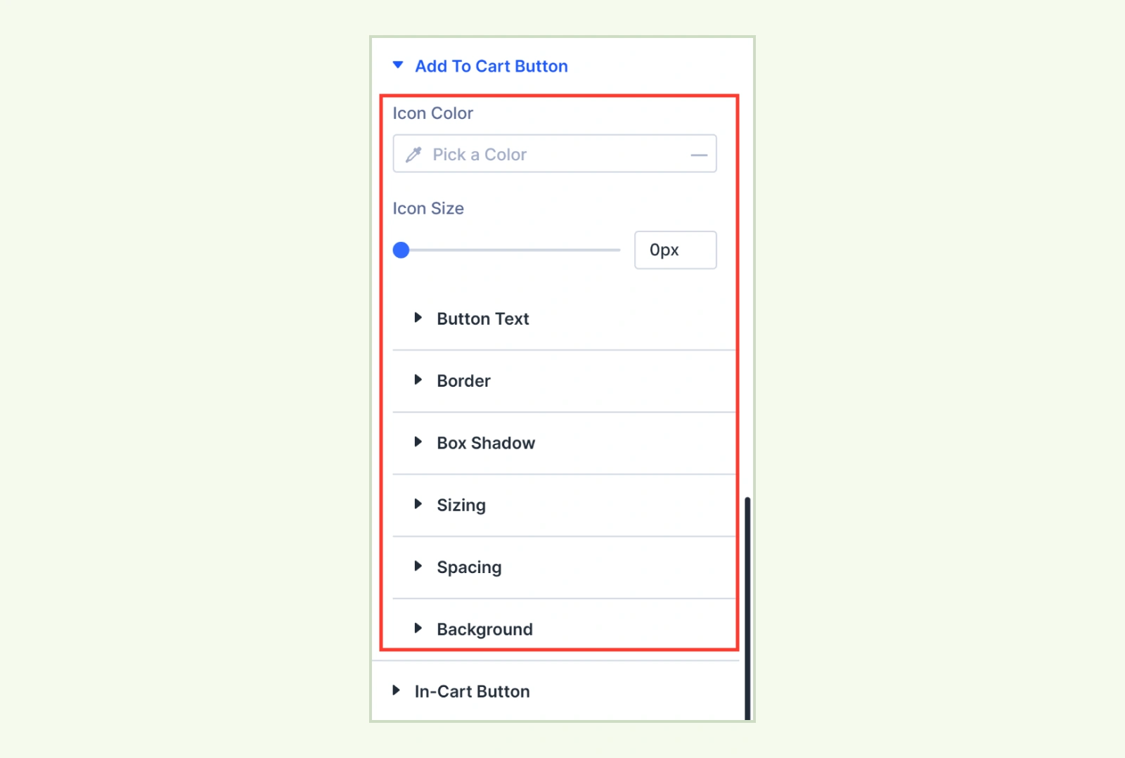
- Icon Color: Set the color of the Add to Cart icon. (Available when Show Add to Cart Icon is enabled.)
- Icon Size: Adjust the size of the Add to Cart icon. (Available when Show Add to Cart Icon is enabled.)
You can also customize the button’s text, border, box shadow, spacing, and background.
In-Cart Button: Use button text, border, box shadow, spacing, and background to style the button when a product or selected variation is already in the cart.
Out of Stock Button #
Use this group to style the Add to Cart button when a product or selected variation is out of stock. (Available when Product Add To Cart is enabled.)
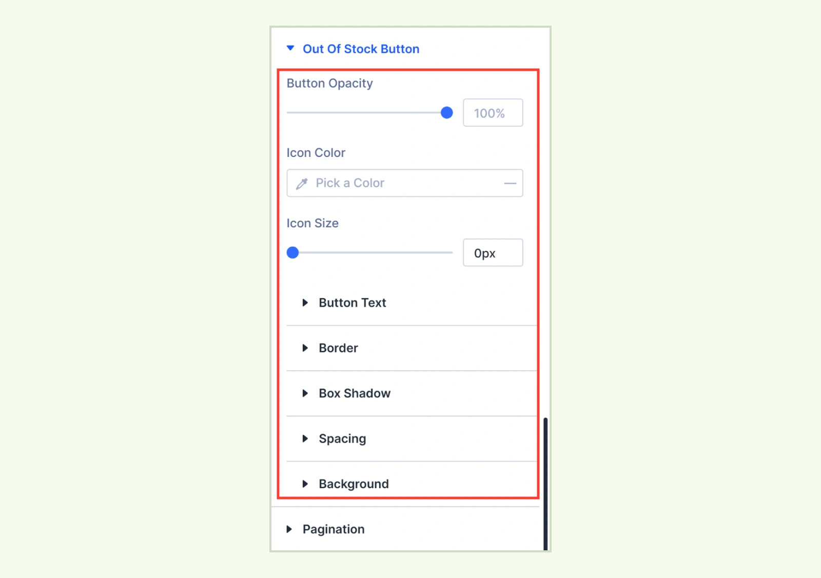
- Button Opacity: Adjust how transparent the out-of-stock button appears. The default is 100%.
- Icon Color: Set the color of the out-of-stock icon. (Available when Only Icon is enabled.)
- Icon Size: Adjust the size of the out-of-stock icon. (Available when Only Icon is enabled.)
You can also customize the button’s text, border, box shadow, spacing, and background.
Quick View Button #
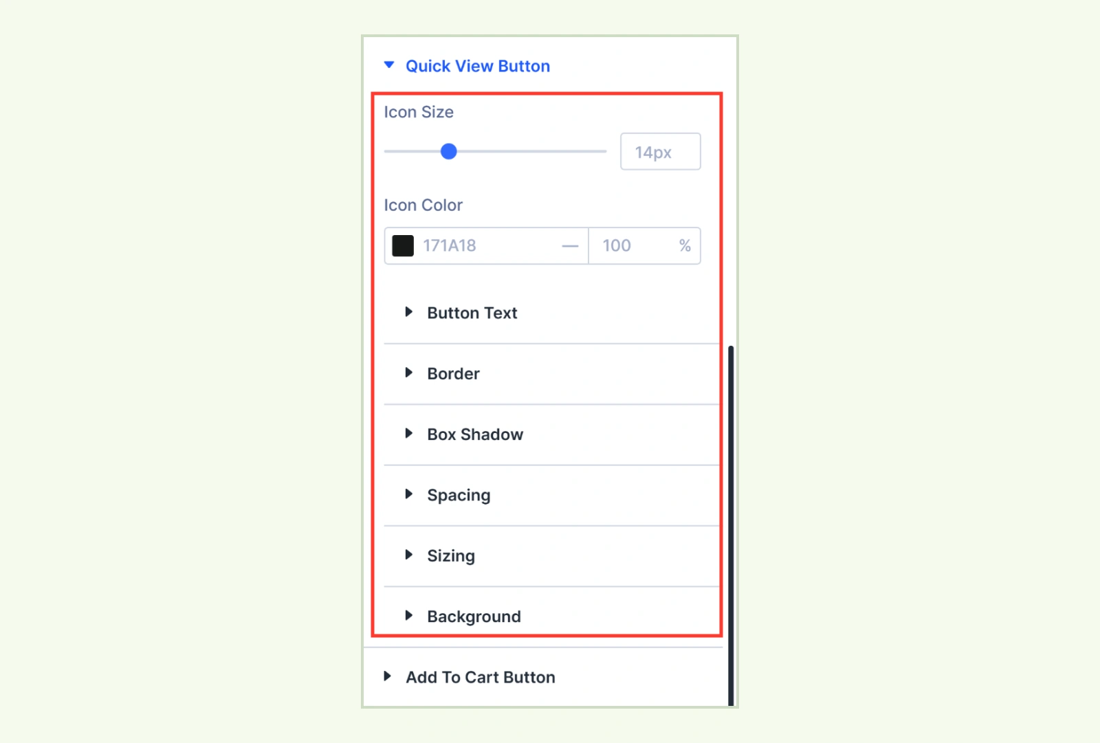
This group appears when the Quick View element and extension are enabled.
- Horizontal Placement: Place the round button on the Left, Center, or Right. (Available when Button Position is set to Over Image or On Image Hover.)
- Vertical Placement: Place the round button at the Top, Center, or Bottom. (Available when Button Position is set to Over Image or On Image Hover.)
- Icon Size: Adjust the size of the round button’s icon. (Available when Button Position is set to Over Image or On Image Hover.)
- Icon Color: Set the icon’s default and hover colors. (Available when Button Position is set to Over Image or On Image Hover.)
- Button Text: Customize the button typography. (Available when Button Position is set to With Buttons.)
You can also customize the button’s border, box shadow, spacing, sizing, and background.
Pagination #
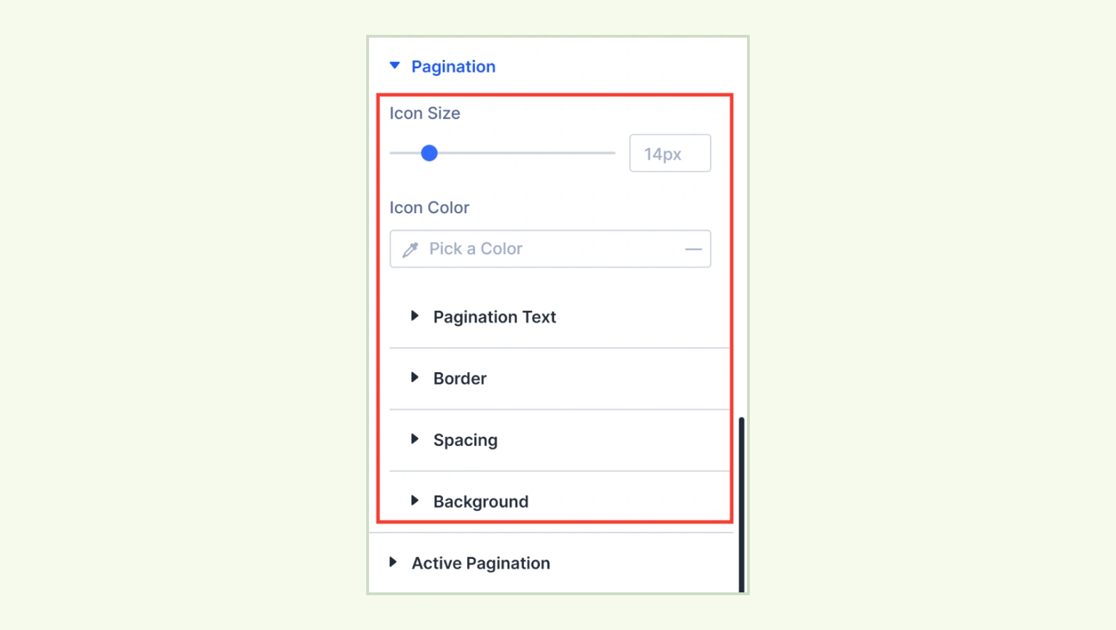
- Pagination Text: Customize the page link and button typography.
- Icon Size: Adjust the size of the Previous and Next icons. (Applies to pagination controls with icons.)
- Icon Color: Set the color of the Previous and Next icons. (Applies to pagination controls with icons.)
- Gap Between Buttons: Adjust the gap between the Previous and Next buttons. (Available with Previous / Next buttons.)
- Gap Between Text and Icon: Adjust the gap between each button’s label and icon. (Available with Previous / Next buttons when Button Content is set to Label & Icon.)
- Loader Color: Set the pagination loader color. (Available with Infinite scroll.)
- Loader Size: Adjust the pagination loader size. (Available with Infinite scroll.)
- Loader Text: Customize the typography of the loading message. (Available with Infinite scroll.)
Active Pagination: Style the current page number’s text, background, and border. (Applies to Page numbers.)
Empty State #
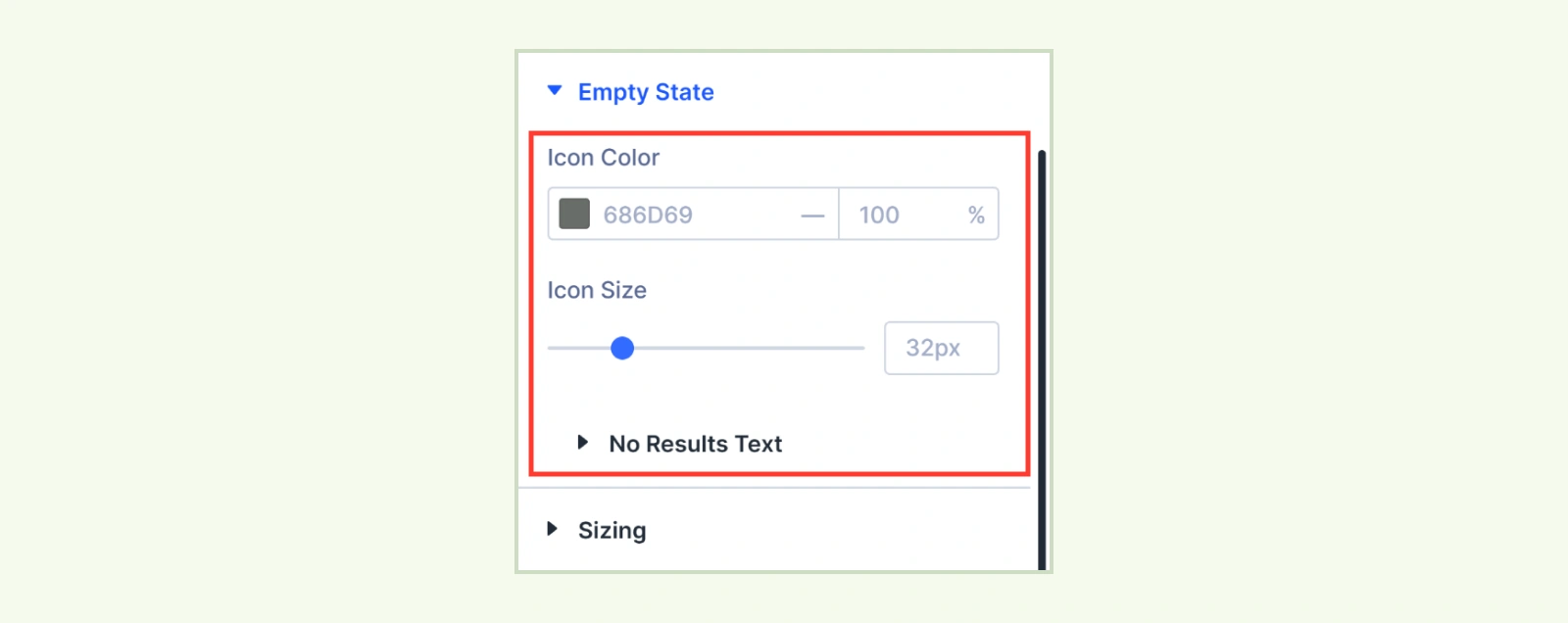
- Icon Color: Set the color of the icon above the no-results message.
- Icon Size: Adjust the size of the icon.
You can also customize the message typography under No Results Text.
Sizing: Adjust the module’s width and height.
Spacing: Set the module’s margin and padding.
Border: Customize the module’s border and corner radius.
Box Shadow: Add a shadow around the module.
Filters: Adjust visual effects such as brightness, contrast, and saturation.
Transform: Scale, move, rotate, or skew the module.
Animation: Set how the module animates into view.
Advanced Tab #
Custom CSS: Add CSS to the Grid, Card, Image, Title, Star Rating, Price, Sale Badge, or Pagination.
Need Help? #
If you have any questions or need assistance, contact our support team: [email protected].


